While we’ve generally focused on Android, iOS and Windows Phone, there are other mobile operating systems on the market.
Such is the case of Firefox OS and Ubuntu for smartphones, two representatives of a new group of players, also including Tizen and Sailfish, that are trying to earn a place among the giants. Both Firefox OS and Ubuntu have an open code philosophy and are opting for HTML as a structure base.
This quite possibly represents a clear shift in paradigm, a new way of perceiving mobile apps that affects design, development and user interaction.
We interviewed the people responsible for the design of
Firefox OS and Ubuntu in an attempt to gain a deeper understanding of what it is that sets them apart.
Firefox OS
Mozilla’s operating system can already be found in some phones available on the market now, and it has the potential to reach many more in the months to come. It is the first bet the creators.

at the same time has clear influences from other operating systems.
Patryk Adamczyk is Chief of Design at Firefox OS. He filled us in on what’s special about the system:
Mozilla’s goal is to keep the web open and allow everyone to have access to the full web experience. Firefox OS not only ships with a fully functional browser but is build only using web technologies, allowing millions of web developers to write apps for the platform without needing to learn a new proprietary language.
In many ways Firefox OS functions in a familiar way to its competitors, as its positioned at users switching from outdated smart or feature phones. The aim was to make that transition smooth. For our version 1, device cost and the learning curve are low with a strong aim at the emerging markets where internet accessibility is untapped, most people access it through their home desktop or internet cafes.
We’ve designed most of the components using pure CSS for speed and scalability. As we progress through incremental upgrades in the coming months our plan is to evolve the UI to feel even more web-like.
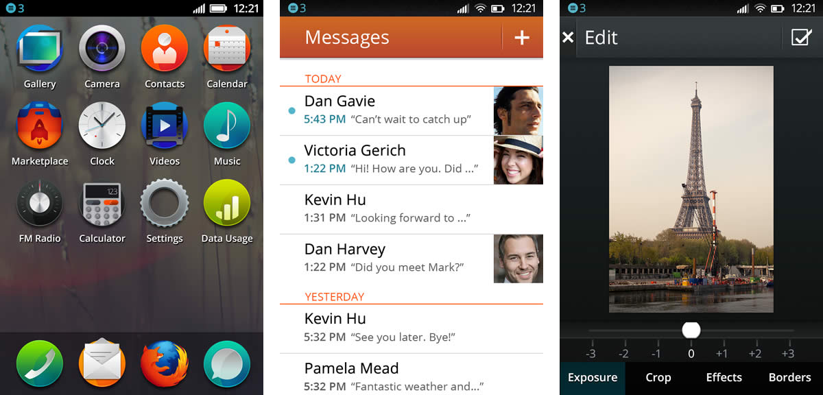
Firefox OS’s design principles were the base upon which a visual style5 was built. Even though we can expect the look of the interface to change and evolve over time, so far, Firefox OS is visually closest to Android, though it also demonstrates influences from iOS and Windows Phone.
The design of this operating system privileges content over container, attaching more weight to visual content, such as videos and photographs, on a grid that varies according to need, complemented by dark backgrounds that make graphics stand out.
The visual style of Firefox OS has textures and volumes, though they are very measured and controlled, especially in the case of apps like the clock, which seems to be made out of real materials.
For Firefox, typography has always been important, and this is also reflected in their operating system for smartphones. Erik Spiekermann’s Meta typeface, used traditionally as the brand’s identity seal, has evolved to become a mobile version called Fira, created by the same designer.
However, some of the more distinctive details of Firefox OS are the round icons on the home screen —something completely different from other operating systems.
It remains to be seen how Firefox OS will develop and evolve in the weeks and months to come. Will it manage to establish a visual identity that truly sets it apart?
Ubuntu for Phones
Ubuntu is a Linux distribution that has been around for a while now. Developed by Canonical, it is the preferred distribution of many Linux fans. It has focused all its efforts on its desktop computer operating system up to now.

However, things started to change with Ubuntu’s first incursions in Android. As a logical consequence, it started to develop its own mobile proposal —largely an extension of its operating system.
Ivo Weevers, Chief of Design for Ubuntu, is the ideal person to answer the question of what makes Ubuntu different from other smartphone operating systems:
Ubuntu is the only platform that offers a true convergent design approach. The same core OS is running across all form factors, including phones, tablets, desktop and smart TVs.
The user interface scales seamlessly and beautifully to adjust for different screen sizes and input methods. This enables unique solutions, such as running a desktop from the phone, or building an app once that will run everywhere.
Clearly, for such an omnipresent operating system, it’s a challenge to maintain design guidelines in each platform.
So, what will be the design principles of Ubuntu for smartphones?
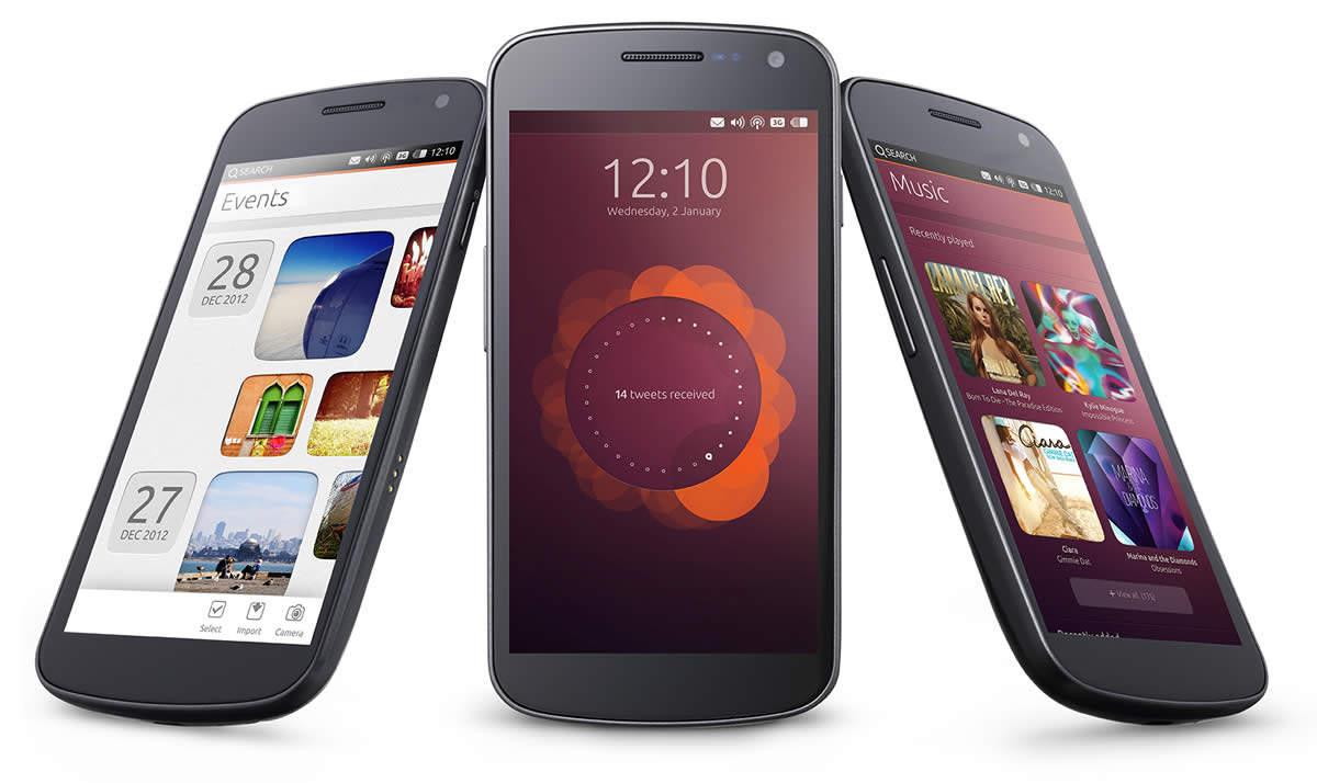
Ubuntu uses simple natural swiping gestures from the edges of the screen to make it easy to access your content and switch between apps.
Every edge has a specific purpose (which takes the edge/gesture approach further than any other solution), making all your apps, content and controls instantly accessible, without the need to navigate back to the home screen every time.
Touch screens started to allow contextual keyboards: only show the keyboard when the user needs it. Ubuntu takes this a step further by showing UI controls only when the user needs it.
We’ve used 3 key design principles, which underlie this design direction: Focus on the content; fast and natural interactions and sophisticated style.
Although some of these principles are mentioned by other platforms as well, Ubuntu is the only one, which make this truly reality through the edge interaction model.
Unfortunately, this operating system is currently only available for Nexus. Those with other smartphone models will have to wait a bit longer to try it out.
The anticipation builds surrounding how the market will transform as new software options develop simultaneously. How will they influence the rest?