
Users are constantly alternating between devices. And much of the time, they’re using multiple devices or engaging in other activities, such as watching television, simultaneously.
Designing a tablet version of an app is a quite natural step. In fact, in some senses, it is a necessary continuation of the experience. But it’s important to remember that you are dealing with two very different devices, not only in terms of size but also in the ways in which they are used (how and where) and the relationships they foster with users.
Both visual design and interaction are particularly affected by the tablet’s characteristics, which is why understanding tablets enables us to make the most of them.
Getting to the Big Screen
Having so much space available can, at first, be disorienting. But like with smartphones, the success of an app’s design for tablets lies largely in the correct use of that space.
A tablet’s screen should not be interpreted only as a bigger area where the mobile phone app’s interface can be transferred directly. Here are a few things to consider:
Visual Strength
A tablet enables a better appreciation of graphic details and interface approach. The smartphone’s screen limits space in such a way that all visual components are conditioned by the area around them. On the tablet, some icons and illustrations have more space to be visualized and displayed.
This directly affects the quality of the images and the level of detail of the work involved. Some details that haven’t been previously considered find themselves in the spotlight on a tablet, thus making interface design more important.
Typography
In comparison with a mobile phone, tablets are held in such a way that the screen is farther away from the user’s eyes. This makes it compelling to adapt the fonts used and their visual characteristics, thus ensuring the legibility of texts. The farther the screen is from the user, the bigger the font and line spacing should be to foster correct legibility.
Use of Space
The way in which a bigger space is managed not only has an influence on the visual but also on navigation and, in turn, on user interface interaction.
While the smartphone’s reduced space forces users to follow more steps to access information, in a tablet, this sequence can
be reduced. The tablet enables the inclusion of what would be separated into two screens on a smartphone in one single view.
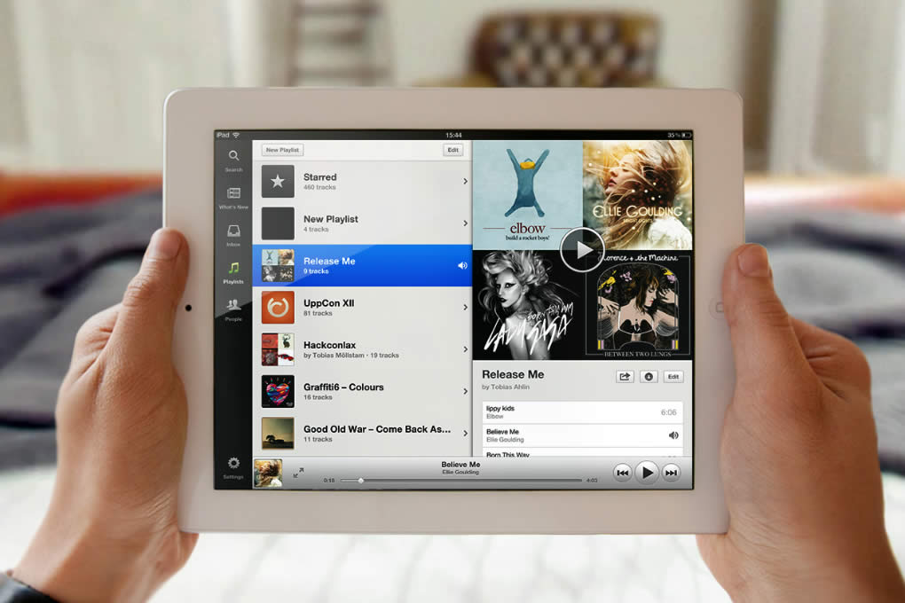
To make the most of the situation, and as an example of use, the left side panel can be utilized to include a list of items, and the content can be displayed at the same time on the right side of the screen. Elements and content are related at a glance, without having to change context. In an email app, you can
view inbox elements and message content simultaneously.
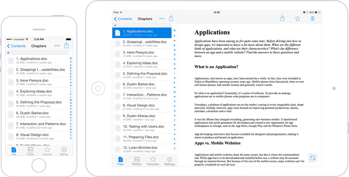
Having more space also makes navigation easier, since fewer levels are needed to find specific content. The screens previously separated by depth can now share the same level.
Operating systems offer different ways of making the most of space and managing panel division. Independently of the choice, it’s important to relate the selected item to the one visualized and decrease the interruption caused by screen navigation. This can be done by moving the main content to a central area, with the help of dialogues and floating elements for secondary actions.
These divided views should be considered horizontally and vertically, anticipating how they will adapt to orientation changes. It’s important to consider this, because with a tablet, orientation change is much more frequent than with a mobile phone. On the iPad, for example, the elements on the left column when in landscape format can be accessed from a drop-down menu when the tablet is in portrait orientation.
Gestures
Sometimes, a smartphone imposes restrictions because it is uncomfortable to make gestures with more than two fingers at the same time, or because of the lack of space and distance that separates them when making the gestures. In a tablet, gestures can be easily made.
There is much more freedom when it comes to manipulating directly the graphic elements of the interface, with less need for buttons and controls to perform many actions. For example, rotating a photograph, a task that used to be somewhat difficult, can be done with two or three fingers, and can become an easier action.
Context of Use
In general, the device used is affected by its context —where we are, what we want to do, and how much time we have.
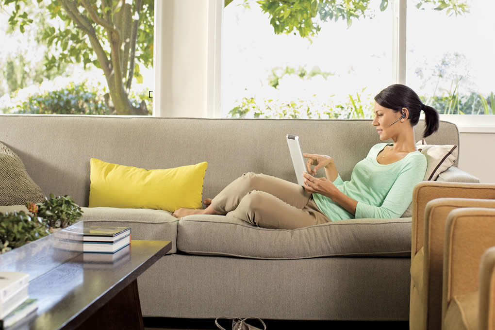
A tablet is usually more related to a home environment. It’s common to use it laying down on a sofa or bed. The user is generally more relaxed and has more time to spare than with a smartphone.
are more associated with a home use context, where users are more relaxed and have more time to interact.
Here’s a statistic: tablet users spend almost twice as much time on the internet than mobile phone users, especially for news and entertainment.
This context establishes a very important difference, because it affects the way users relate to the tablet and how they interact with it. In consequence, it influences how apps are used.
Interaction
Tablets are harder and heavier to transport than smartphones. The user needs a supporting point that allows him or her to bear the weight of the tablet.
Depending on whether they’re holding the device in portrait or landscape orientation, users have different levels of ease of access to varying parts of the screen (the lower corners). This is where the most frequent actions should be. Locate outside of this comfort zone should be actions that are more critical or have a bigger impact, thus reducing the risk of them being tapped by mistake.
of the screen provides easier access, and the upper area presents more complexity.
Interactive elements located at the center and superior parts of the screen should be reduced. Placing them in these areas requires the user to cross his or her hand and arm over the screen, blocking content. This renders it impossible to see the element being tapped and the result of the action.
Functionality
Users most often use their tablets in the comfort of their own home, where they share the devices with others. These factors mean it’s important to rethink the tasks performed with an app.
In a smartphone, for a user that many times is on the move and more focused on performing quick tasks, some features are pointless. In the case of a tablet, the situation is quite different. That’s why some of the functional characteristics that had been relegated now make sense.
You can broaden and improve user experience without losing focus on tasks that contribute to the app’s goal. As we said before, it comes down to making sense—not adding in elements just because.
Consider an app used for visualizing documents that also allows for editing. While performing these tasks on a mobile phone can be quite hard, data and text input on a tablet is relatively easy.
App Content
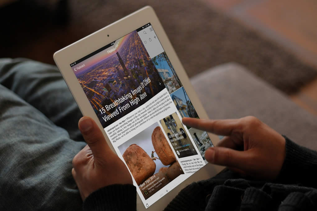
Tablets are the preferred target of some apps that, because of their content, require a more relaxed use context.
this concept with screen transitions.
This is the case of apps that require reading extensive texts, such as newspapers and magazines. An example of this is the iPad2 version of Flipboard, an app that really makes the most of the experience by replicating a magazine and transferring the concept seamlessly through information quality, visual design and animations.