
Interface Styles
An app’s interface is like the clothes a person wears on the street. It is the layer that separates the user from the functional core of the app, the place where interactions are born.
To a greater extent, it is made up of buttons, graphics, icons and backgrounds, with different visual appearances in each of the operating systems. Android, iOS and Windows Phone have their own ways of contemplating design.
The designer’s job consists of interpreting the personality of each operating system and pouring in his or her own vision and design style in order to make apps that, besides being easy to use, are different from the rest and have visual coherence with the platform.
The Simple Beauty of Android
Android’s design is based in a brilliant cleanliness with regards to the composition of the interface. Each graphic, button and text is accompanied by the idea of visual uncluttering, at the same time dazzling with the smaller details.
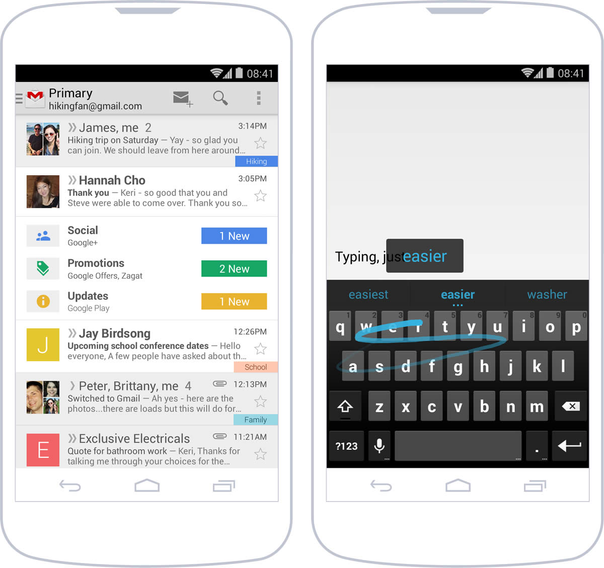
Roboto, the operating system’s typeface, is what gives it a lot of its identity. It is combined with a well-defined style of colors and buttons. Android relies on simplicity that is controlled but not boring, and on certain occasions, it breaks or transcends its own formalities to captivate the user.
iPhone, Searching for Visual Lightness
Leaving behind the style that characterized it up to its sixth version, iOS currently advocates an ideology shared with other operating systems: strip away all unnecessary elements, privileging content over the container.
In order to achieve this, it has reduced controls and graphics to the very minimum, always with the idea of visually lightening the elements on screen. This concept is supported by typographic choice—Neue Helvetica, often in lighter versions —and colors —white backgrounds with stronger hues for icons and texts.
Each component of the interface is treated as a layer superimposed onto another, sometimes with a certain transparency and blurriness, which gives a sense of continuity and permanence in the context.
Windows Phone’s Flat Design
Windows Phone’s design style is a flat one, without bevels, gradients or excessive aesthetic decorations. This visual cleanliness also applies to content. Only the most important content remains on screen, highlighting it within a specific context.
The interface consists of an infographic approximation for the icons, with a heavy use of the grid and typeface as one of the main resources to imbue the design with personality.
Native and Custom Interfaces
Native interfaces are based on elements like buttons, lists and headings that are preset in each platform. They have a defined aspect with respect to the basic characteristics of appearance, such as color, size and font, which can be adapted to a greater or lesser extent to attune them to the desired aesthetic.
When starting to design, it is often best to define the interface with native controls. This provides a solid base to start from and also eliminates the need to create all elements from scratch.
The inconvenience with native interfaces is that they limit the personality of the design. And sometimes, you really have to take the design to the next level. In such situations, all or some elements of the interface can be personalized and recreated as images. For example, a customized visual element could be a text field inside a form that is generated as an image to take advantage of the possibility of including textures, bevels or specific shadows that a native control may not offer.
If the idea is to design a custom interface, this should be planned out beforehand, because it incurs more complexity and development time. Likewise, not all designs for these kinds of interfaces appear accurately in the functional app, because their correct implementation depends on the developer’s proficiency.
Decisions, Decisions
But when should native and custom interfaces be used? In most cases, it’s not about choosing one or the other, but about striking an adequate balance that combines both. It’s most common to start from a native interface and customize only the elements considered necessary.
The kind of app also determines this matter. For example, apps that value visual details and experience in general tend to have more than one customized element. Such is the case of Path and its way of adding moments, something designed and developed especially for the specific nature of the app.
There are other apps that place greater value on completing tasks and benefit from a cleaner appearance that does not distract from the process. WhatsApp is visually based nearly entirely on the native elements of the operating system.
Apart from the objective and type of app, there are other variables that should be considered. Native interfaces have in their favor the fact that they are composed of elements with which the user is already familiar and therefore don’t require any learning or adaptation. This can have a positive influence on an app’s usability.
Customized interfaces, however, can offer a more finished look. But when working with them, it’s necessary to consider their compatibility with multiple devices and performance in general (an excessive use of images can slow an app down).
Visual Identity
An app is, among other things, a communications tool. It is part of a system and an opportunity to extend a company or a product’s identity. Through the different screens of the app, colors, fonts and backgrounds act as elements that reflect that identity.
Clearly, one of the components of identity is brand. Even though it may be tempting to make extensive and repetitive use of the brand, it’s best to include it in places designed for that end, for example, on introductory and login screens, or in the about section. This ensures the correct exposure of identity without affecting navigation or user experience.
Icons and Launch Image
First impressions are lasting impressions. And in the world of apps, that first impression is limited to two visual components: the launch icon and the launch image —also called splash —that will appear when an app is opened.
These elements will be seen before anything else, even before the app is in use. You’ve got to appreciate their importance and pay attention to how they’re dealt with to start off on the right foot.
Launch Icon
An app is a product on a shelf next to many others, and the launch icon is its packaging.
This icon will represent the app in different app stores, along with screenshots and promotional texts, and serve as a sales element to get users to download.
faces lots of competition when a user finds it in search results, in this case, Google Play.
Once this step has been completed and the app is installed, it will exist next to the many other apps that are also in the user’s possession. That’s why the launch icon should be distinctive and representative of the app. Distinctive, because it must differentiate from the rest, even from those with similar functions; and representative, because the visual characteristics must communicate clearly the main objective of the app. Simple, uncluttered shapes with significant attention to detail are those that are most effective.
Size is also something to take into consideration. An icon may seem large in an app store but become much smaller once installed. When designing, all possibilities must be considered, and more or less detail should be added and subtracted according to dimensions.
To be more specific, each OS has different requisites that the launch icon must fulfill. Android and iOS have detailed visual style and technical requirements.
In Android, icons are objects represented from the front, with a slight perspective, as if they were being watched from above. They portray volume and depth, playing with transparency to integrate better into the screen. Shapes are distinctive, and realism is limited.
The situation is different in iOS. Generally, icons are highly simplified representations of real objects or abstractions of the app’s concept. The icon has only one main element, without many details, on an opaque background. To complete the visual look of the icon on the screen, iOS adds rounded borders to the image, which must be square and abide by size requirements.
Meanwhile, Windows Phone has a very characteristic style in which icons are pictographs. Shapes are extraordinarily simple and in plain colors (especially white), with almost no details, and they are perfectly integrated with their container. Transparency is fundamental, since images are located inside a square shape on a background color that can change according to the user’s chromatic preferences.
Interior Icons
Once inside the app, interior icons have less prominent, more functional roles than the launch icon. They can go unnoticed, but their job is worth consideration.
Their use is generally associated with three scenarios. First, they act as visual aids to reinforce information, for example, in a dialogue box with an alert. Second, interior icons complement interactive elements, when they are inside buttons or tabs. Finally, they improve the use of space. In such cases, the icon visually condenses something that expressed in text would be too long or difficult to understand.
Icons must transmit the actions they perform by themselves, depending on their context. For example, a delete icon may be related to only one element in particular or to several, depending on where it’s located and the element of the interface visually associated with it.
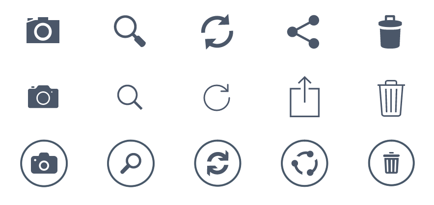
When icons accompany certain actions —if they don’t have text labels that help exemplify their function —it’s more important for them to be clear and representative. This happens when, because of space limitations, an icon and text can’t be included at the same time. This is a trend that’s becoming more and more common in applications.
The interpretation of icons assumes a certain amount of subjectivity that must be eliminated through correct use. For example, each platform has icons associated with actions like search, save and edit. The user already knows what they mean; therefore, using them as expected will help with consistency and improve usability.
Launch Image
Also known as a splash, the launch image is the first screen the user will see when the app is launched. Lately, the use of this screen has become more restricted or even avoided all together. It is generally shown quickly the first time the app is opened. This screen is the presentation of the content during the initial load, so it’s normal to display a load indication with the rest of the graphic elements.
The launch screen is so ephemeral that it is only visualized for a couple of seconds at most. Because of its short lifespan, the information shown should be limited to the name and version of the app.
In some cases, this splash is a representation of the app’s container: an almost identical image to the one the user will see when the app is finished loading, but without the data that might change, such as text, button labels and status bar elements, seemingly making it more fluid to load.
In the case of Windows Phone, the operating system is in charge of managing the launch screen, consisting of an enlarged launch icon.
As for the orientation of this screen in smartphones, it’s worth remembering that it is generally displayed vertically. With tablets, it’s necessary to determine the orientation being used when the splash is shown, and according to that, use the corresponding version for portrait or landscape orientation.
The Grid
The grid is the invisible structure upon which all visual elements are propped. Their function is to separate each of the components of the interface into a neat space, organizing the areas that will be left blank and those that will have shapes. A well-defined grid transforms into a design aid that, by generating order and simplicity, improves the app’s usability.
In its most basic shape, the grid consists of a simple module: a square of a certain size that is used as reference. In turn, this module can be divided in submultiples for smaller spacing.
When interface design is being developed, the grid is represented with guiding lines. Once the structure is finished, it can be perceived as a visual rhythm that places elements harmoniously in a space.
When designing interfaces for mobile devices, the grid helps determine margins and button locations, the separation of fonts and the inner and outer space of the containers. Of course, each operating system has a different grid, and therefore, a different module.
Android
In Android, the basic module is 48dp, equivalent to nine millimeters, the minimum size recommended for interactive elements. Complying with this size and abiding by the button dimensions ensures they can be touched with the finger without problems, a fundamental consideration in mobile design.
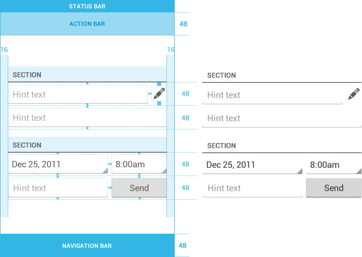
On the other hand, for spacing and separation, an 8dp module is used. For example, row content has a separation (upper and lower) of 4dp. As a result, when two rows are one on top of one another, they conform a total space of 8dp between them. In the side margins, the designs are usually 16dp, or two 8dp modules together.
iPhone
Designs for iPhone are also based on a grid, but in this case, the base module is 44px to ensure that buttons and list elements can be tapped easily. Many apps for iPhone follow this rule, and it is recommended by Apple.
This 44px module is divided in others of 11px that, when repeated as many times as necessary, create spaces and separation between tables, buttons and other elements of the interface, generating a vertical rhythm.
Windows Phone
In Windows Phone, the grid is more evident because of the use of square shapes in the interface. The home screen of the operating system is based on tiles, which clearly demonstrate the distribution and size of the main elements.
The grid is based on a 25px module with a 12px separation. This formula, repeated on the whole screen, creates a visual structure where designs are created. Additionally, the rows and columns can group in different ways in order to accomplish personalized designs that make different uses of the space.
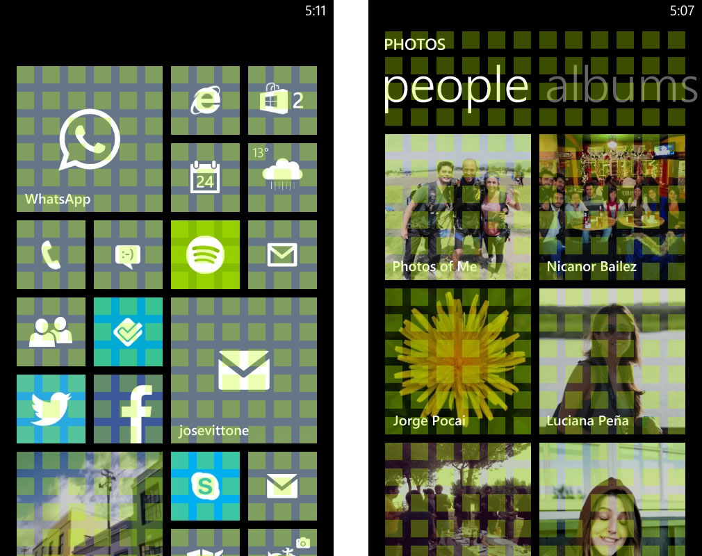
Lists, graphics, photo thumbnails and buttons use the grid as their base and, as a result, create a stable appearance that provides a sense of order, simplicity and visual cleanliness throughout all of the screens of an app in Windows Phone.
Typography
The goal of the typographic font is to make the text easily readable. This can be achieved not only with an adequate choice of font, but also by managing the size, line spacing, column width and visual contrast with the background.
On this last point, contrast is of the utmost importance. A mobile phone is a device often used outside of the home and on the street. The sun may shine directly on the screen, and if there isn’t a good contrast of typeface and background, the text will not be readable.
Typography is a component that, like buttons and graphics, also rests on a grid that will define its location and position in the general context of the screen.
Serif or Sans-Serif
Generally, the debate on font choice is concentrated mostly on typefaces with serif and without serif. Admittedly, in small sizes and low resolutions, cleaner, more open and sans-serif fonts are better, but serif fonts can be considered for main titles, when size means that serifs will not be an obstacle to readability.
Even though it’s not common to use mobile phones for prolonged reading, correct legibility is a fundamental part of design. As such, typefaces are as important as any other visual element of the interface and shouldn’t be taken lightly.
Legibility and Resolution
Because mobile devices are a digital medium, they have their own characteristics and some limitations that are different from traditional print media. The screen has a lot of influence on typographical behavior and performance when taking into account that it is, in many cases, extremely small.
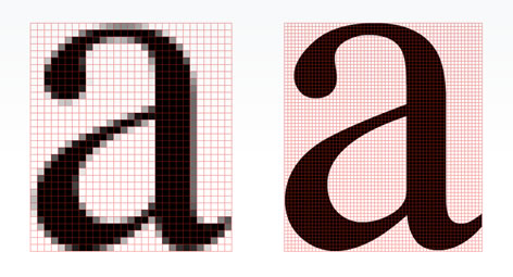
Currently, a number of devices have screens with good resolutions, eliminating a complexity factor and a need for concern when the time comes to decide on a font. These kinds of screens can be found in high-end mobile devices; however, there are other smartphones with less interesting characteristics.
In the latter case, choosing typefaces is a quite difficult task that is not limited to the selection of family and size. The smaller the screen, the greater the chances that characters will be poorly displayed.
Minimum Sizes
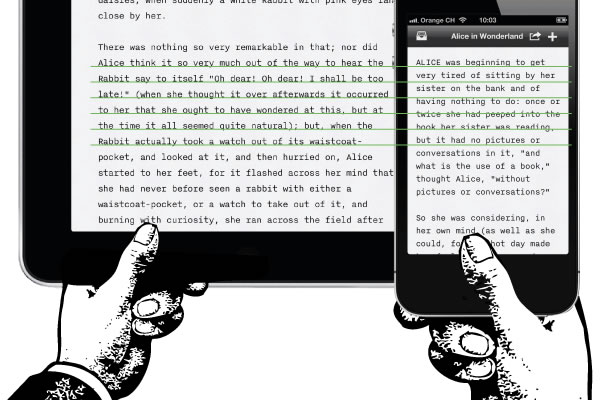
In digital media, such as a smartphone or a tablet, something that conditions the choice of typeface size is the holding distance. Mobile phones are usually held in such a way that the screen is closer to the reader’s eye than in the case of a tablet, allowing a smaller typeface.
At the same time, in smartphones, the screen space is much more constrained, forcing an adjustment of line spacing and character separation to make the most of the area available without affecting readability.
Minimum sizes can vary according to operating system, screen resolution and font. In any case, when using small sizes, it’s advisable to choose simple and open fonts, with character, line and margin spacing to accomplish a visual separation that makes them easy to read.
The best way to ensure correct legibility is to test the font on the phone for which it’s being designed. Computer screen designs tend to be deceptive, and testing designs in the most real environment possible enables adjustments and corrections until the adequate size is found.
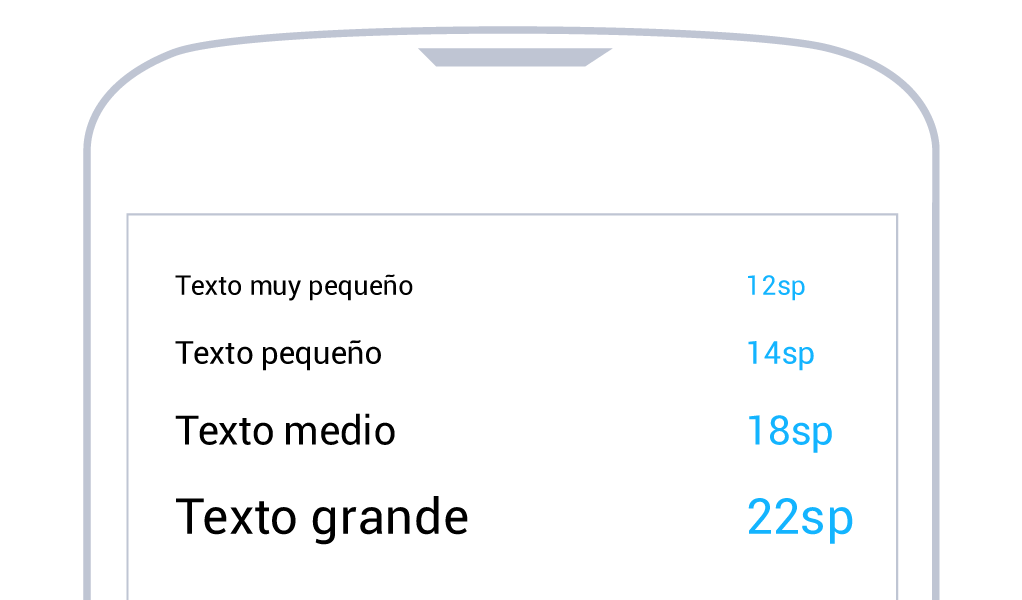
In Android, font size is measured in sp (scaled pixels), a way of modifying a font scale according to screen size and user- defined preferences in the smartphone’s configuration. The most common sizes are between 12sp and 22sp.
Size varies in iOS, depending on where the text is located. In the case of the retina density, main titles are around 34px, and the size of labels inside important buttons is approximately 28px. From there, it starts to get smaller in the different elements, nearing 14px. However, it’s advisable not to use dimensions smaller than 20px in reading texts.
In Windows Phone, more than in other platforms, design depends heavily on typography. A bad choice of font size in an app that already has few visual elements can spell disaster. We recommend not using a size smaller than 20px for smaller texts, and in the case of titles, considering sizes up to 70px.
Hierarchies
As a visual element and component of an interface, typography is also subject to hierarchies. Its importance depends not only on function but also on the information that it contains and its position on the screen.
To define different levels of importance in a text, besides size, you must consider the other variables (bold, regular or light, etc.) and color.
A text with a higher hierarchy is that which is located as a main section title. On the other hand, the information contained inside a row in a list can have several hierarchies. In an email, for example, it could show the name of the sender, a summary of the content and the date sent. All of those elements are more or less relevant, and defining their importance is the first step in determining the typographic style that should be applied.
Operating System Fonts
Android, iOS and Windows Phone all have their typographic preferences and sets of system fonts. This doesn’t mean the designer should necessarily follow them, but choosing one of the options available will help relate with each platform’s identity.
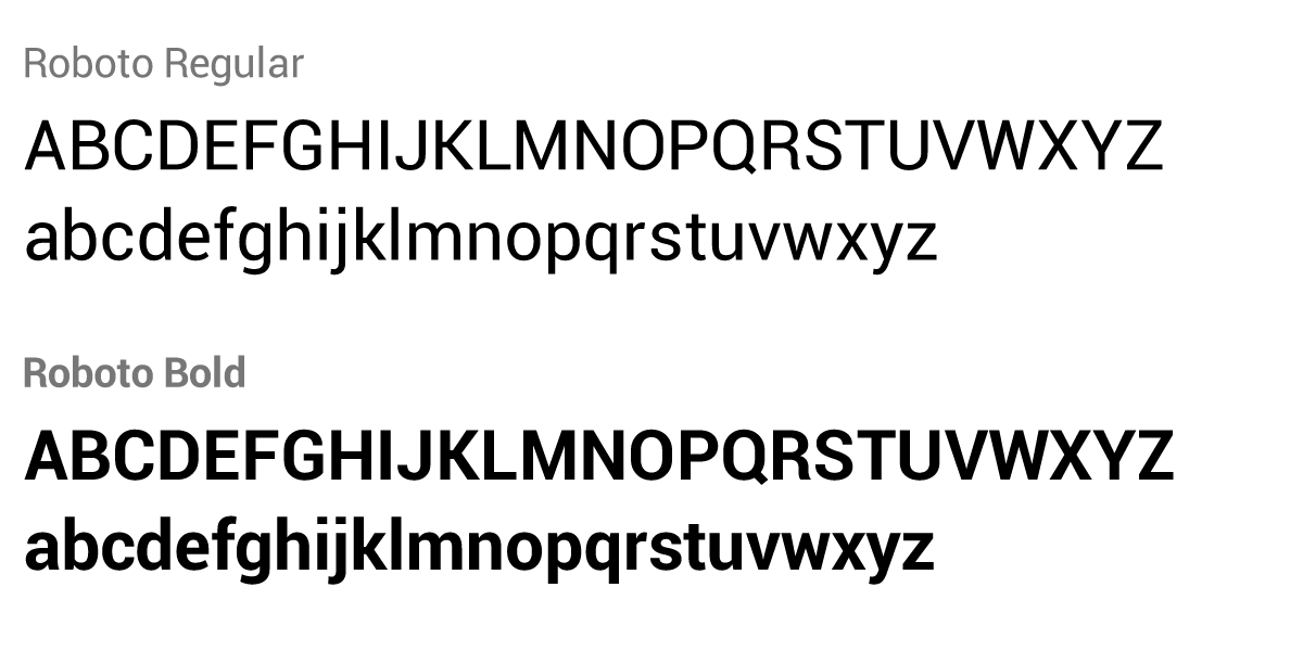
In the case of Android, the Droid Sans family was historically the most often used and marked an age of the platform. However, in the latest versions of Android, it has been replaced by Roboto, which is especially designed for high-resolution mobile phones and boasts variants that go from thin to black.
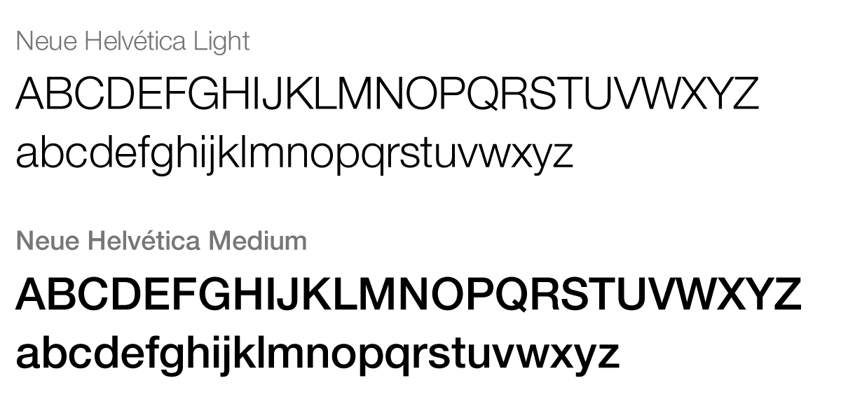
Neue Helvetica is the most emblematic iOS font, and many apps use it. Over time, it has transformed into a brand identity for the operating system. However, there are more than 260 fonts available that can be used natively in iOS7.
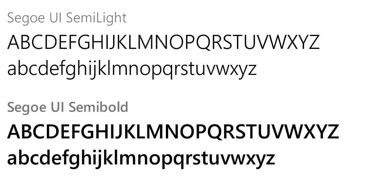
Windows Phone introduced Segoe UI as a hallmark that accompanies the clean, modern and geometrical style of its interface. Even so, it has a series of type families that complement it, particularly in cases where special characters are needed that are not found in Segoe UI, as in foreign languages.
All of these operating systems also allow the incorporation of additional fonts. But bear in mind that variety and quality are two very different things: many of the fonts available were not created for legibility on a screen.
Color
Color is a vital resource in an app’s design. The use of color comprises headings, texts, buttons, backgrounds and many other elements that make up the interface. In some instances, it’s associated with identity (corporate color) and in others, it responds to aesthetic criteria and design decisions.
A color on its own, except in the case of reserved colors, doesn’t mean much. As part of a chromatic system, it is consistent, conscious and context-related use that gives color meaning for the user.
Reserved Colors
Because they have connotations that can’t be avoided, there are certain colors that must be used cautiously. They are referred to as reserved colors, and their use should be limited especially to those listed below:
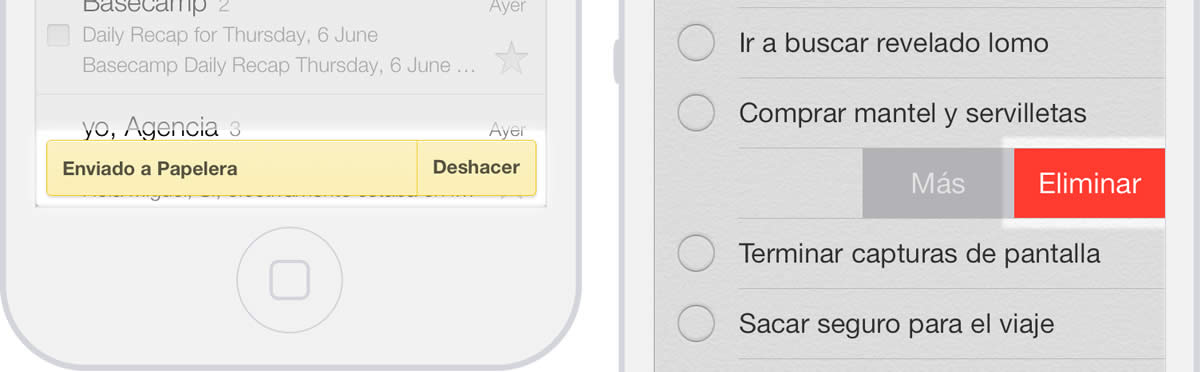
Red: For errors and important alerts.It’s a color that naturally indicates danger and immediately catches the eye..
Yellow: Warning. It indicates that the action about to be
performed implies making a decision that causes a certain
consequence; therefore, the user should be careful.
Green: Success and confirmation messages that an action
has been performed correctly.
In Texts
Color can be used to highlight phrases and words that can be tapped, as in the case of links. It’s important to maintain visual consistency so as to allow the user, intuitively and at a glance, to know what the interactive typographic elements are.
Another function of color in texts is to assign hierarchy to content. Complementary information can be highlighted or minimized depending on the color used. For example, content of a certain level of importance could be highlighted in the text by using a different color. In the same way, color can also be used to identify secondary information by using lighter tones that are less prominent.
In Backgrounds
Background color must be in line with the color chosen for the typeface, since a minimum contrast is necessary for reasons of legibility and accessibility.
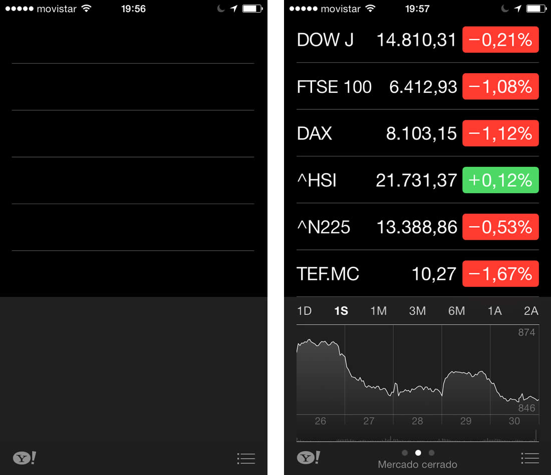
Dark backgrounds can cause the eyes to strain more quickly, so if the app is frequently used or requires reading for a considerable amount of time, it’s convenient to revise the chromatic choice and take the background color to a lighter alternative. However, dark background colors can be a good alternative when the content is highly visual, as in the case of photographs or videos, since it helps highlight these elements.
In Interactive Elements
It’s possible to resort to color as the answer to or as feedback on concrete actions of the user, an option that many times is not taken into consideration. Selected or tapped elements like buttons and rows can be highlighted in a color that visually indicates where the user has tapped, something that is particularly difficult to tell in a mobile device.
In the case of disabled elements, color is generally lighter than when the element is in its normal state, and it’s even possible to resort to the use of transparencies. In any event, the objective is to indicate, in an obvious way, that the element will not produce an effect when tapped.
In Headers
Besides highlighting them as the main element, when color is used in headers, it must be in complete harmony with the background and the other elements on the screen. In the end, it’s an important space that will be used, for example, to place the different section titles and other interactive elements that have an incidence on the content of the screen being watched.
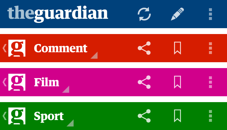
Since headers are present in different sections of the app, chromatic consistency must be maintained when navigating different sections. However, some apps (an example being that of news publication The Guardian) make use of headers to play with variations of color that mark a visual difference between each section. The header extends visual identity and at the same time gives the user a better understanding of the section he or she is visiting.
Default Colors
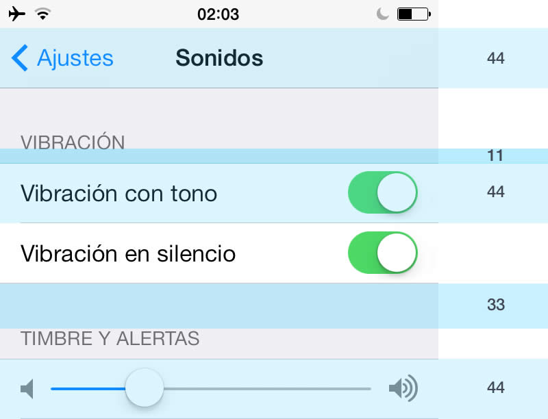
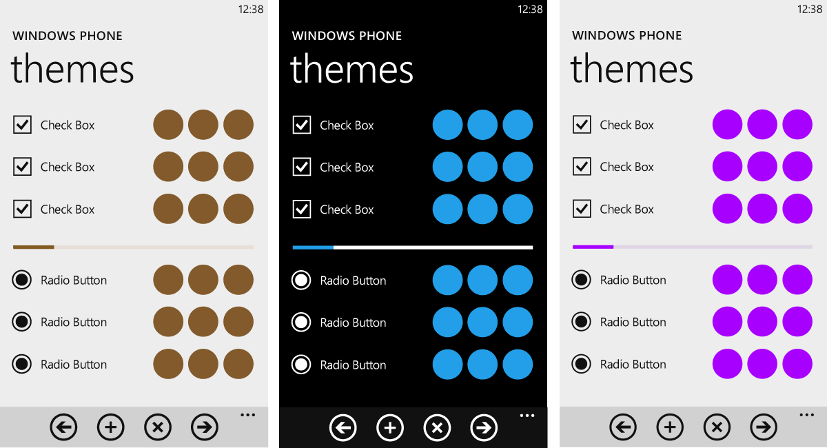
Android and Windows Phone use themes that affect the color of their apps and that can be light or dark. In Windows Phone, the choice of available themes is left to the user, who can modify the interface display of the entire OS.
to highlight important elements.
All native elements of the apps are modified by this decision. Dialogues, buttons and list backgrounds will be visualized according to the chosen theme. However, in Windows Phone, respecting the user’s choice is up to each app, because even when the user has chosen a color for his or her theme, the app can decide to use a different chromatic option. For example, even if the user chooses a dark color as the theme, the app can show elements in white.
Maintaining the user’s theme selection has advantages and disadvantages that must be considered in design. For example, using the color of the theme chosen provides visual consistency and comfort throughout the whole operating system. The user feels he or she is always in the same context. However, differentiation from other apps can be low, and it decreases the possibilities of incorporating corporate colors.
In Android, theme choice is not a user option. Designers are the ones in charge of deciding whether to apply dark or light themes to the whole app or only to certain screens.
In both cases, the colors of the themes are combined with other secondary colors, their function being to highlight elements that require attention. In Windows Phone, this secondary color can also be chosen by the user from a list of options in the preferences section, but again, the app doesn’t have to abide. And even though the chromatic palette offers other options that can be considered when planning visual design, in Android, blue is recommended as the secondary color.
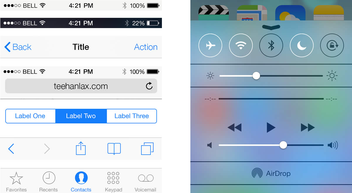
iOS colors are based on black and blue hues.
Because it has no themes, the iPhone presents a quite different case. Color proposal is native, established by default, and is based on clarity: white and grey for backgrounds, toolbars and section headings. These elements also have a certain transparency that displays what’s behind. While black is used for informative elements, blue is used to highlight the font in buttons and form labels as well as other elements that should stand out (icons, selected tabs, controls). Even so, the colors of these elements can easily be changed.
Language: Mind Your Words
An app is full of places for text —in headers, titles, buttons, error messages and empty screen notices. In each case, words are as important as the graphic elements that contain or accompany them. Textual and visual languages go hand in hand to create a user experience that is consistent in all senses.
The Wrong Word
At the beginning, how a phrase is formulated is often overlooked, even though it has a direct influence on the way the user utilizes and relates to the app. For example, labeling a button incorrectly can lead to confusion as to the result of an indicated action, causing uncertainty and frustration for the user, who as a consequence makes a mistake.
Situations like this are frequent. Even though it may seem obvious, a message should be understood easily by the user and require little to no interpretation. This can be achieved by using a simple and direct language.
The Receiver
As with any message, an app also has a receiver. Getting to know who the receiver is allows a deeper understanding of how to address him or her. This is essential in determining how to articulate phrases and the language used. It’s not the same to talk to a child as it is talking to an adult, and you can’t address a tech expert in the same way you can a novice. All of this influences word choice.
In the world of apps, you often come across products that use too much technical jargon. This results in messages full of technicalities or complex words that an unprepared user could find difficult to digest or that sound too strict. For example, the word “access” can be replaced by “enter,” a more pleasant synonym.
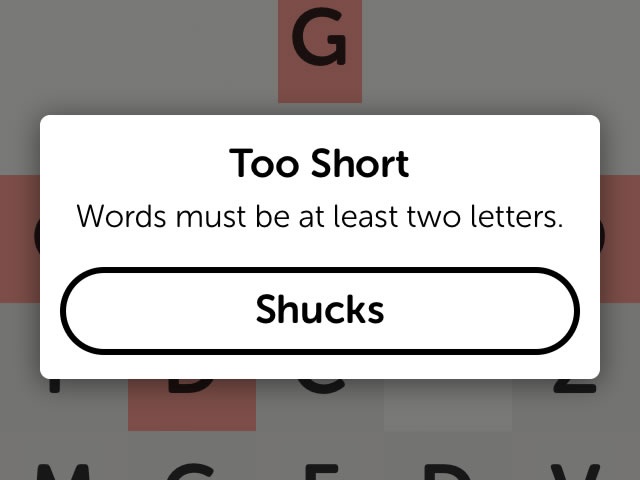
Communicating Mistakes
The way of communicating mistakes deserves its own section. The scenario can prove stressful and unpleasant for users, so friendly messages are essential. Technicalities and accusations must be avoided. An example of this is the sense of humor that Letterpress has when communicating errors. Since it’s an entertainment app, the team takes advantage of the user’s disposition to have fun.
Texts in Other Languages
When an app is available in different languages, you’ve got to pay careful attention when incorporating translated text and ensure that it fits and displays correctly in the visual space assigned. Depending on the language, some words may be (a lot) longer than in the original language and would end up being cut off or hidden under other elements of the interface.
Visual Details
The difference is in the details. They can be what set an average app apart from a great one. At the start of the design and development process, attention to detail is minimal and often falls secondary to other aspects of design. But as the interface enters its final stages, it’s important to consider all details and catch anything that could ruin all of the hard work performed.
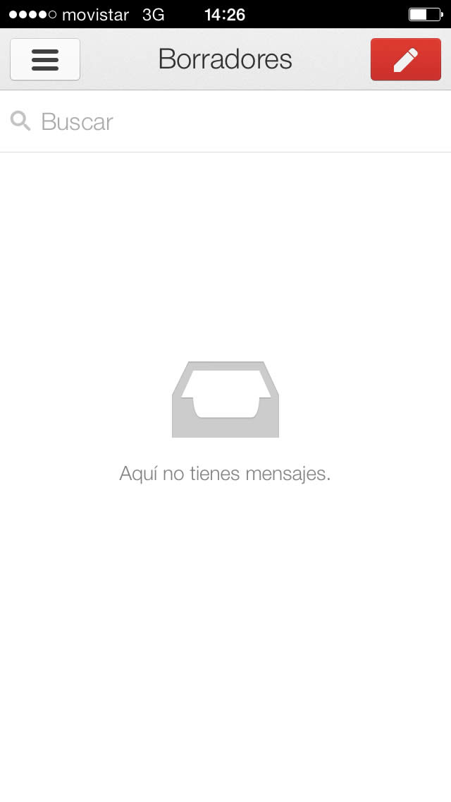
Empty Screens
When designing, not only the ideal scenarios must be considered, like a list that is already completed or a full screen. It’s also necessary to plan the design for when the app is starting to be used and there’s still information missing. For example, contemplate how an empty screen will look without items and when there’s still nothing to show.
Another situation that must be considered is what to do with the backgrounds that appear when lists don’t cover the entire screen and with placeholders where the images would appear once loaded.
Ephemeral Graphics
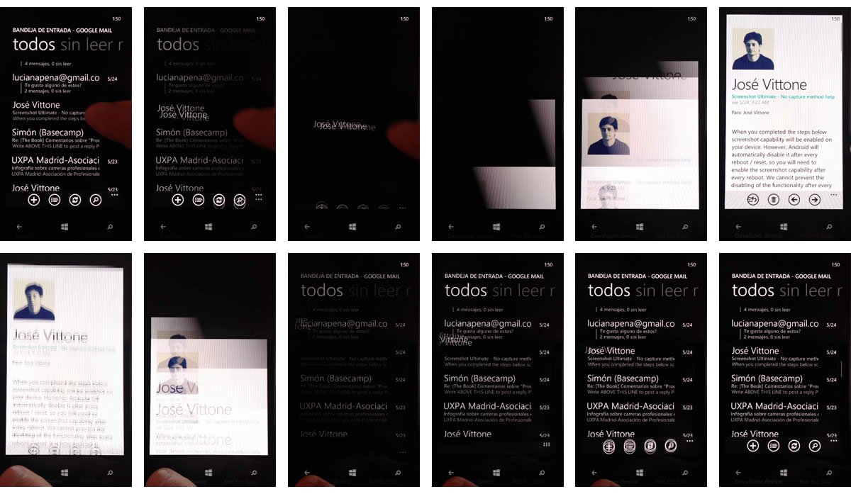
The design of elements that appear on the screen for only a short amount of time should also be considered. For example, if the connection is slow, the user might have to spend more time than expected watching the load screen. This is where visual details experience their moment of glory.
Visual Secret
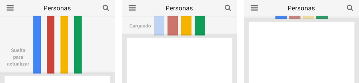
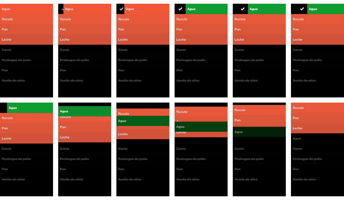
If you want to get away with a few small luxuries, graphics that are hidden at first sight and are not easily accessed by users are ideal. Once discovered, they generate a special pleasure that is supported by complicity. For example, in the Google+ app9, when swiping down to refresh content, a series of colored lines appears —a detail that’s not visible until we perform this action.
Animating the App
Animations are harder to design and render perceiving visual details more difficult. However, they also mark the difference in user experience10, filling the app with life and making it more pleasant to use. At the same time, they accompany a main function or action. They are certainly not fundamental and could go without animation, but, without a doubt, they influence how a user feels when interacting.
According to their function and the way they are used, animations can serve a number of different purposes:
Feedback. On-screen graphics can be animated to show the result of an action. That would be the case of an element that disappears from the screen after an action is executed, showing where it goes and what happens to it.
Transitions. Animations can help make transitions between screens more fluid. This can represent a fluid navigation experience when going from one piece of content to the next.
Informative tools. Especially when the app is being used for the first time, it is important to outline how it is used and highlight the presence of a new component. In these cases, animation can help direct attention, which is, in fact, one of its main functions..
Pure visual candy. Sometimes, animation has no other function beyond catching the user’s eye. It could be a simple detail that not everyone sees but that leaves a lasting impression when noted.