
Understanding Technological Differences
There are countless mobile devices on the market, each with different hardware characteristics defined by the manufacturer. Those that most affect design are related to screen quality, since they will influence interface design planning and, later, the images that need to be prepared for the developer.
Screen Size
A determining factor in mobile device screens is their size: the distance, measured diagonally and in inches, from one end to the other.
In this respect, Android is a very fragmented operating system, because manufacturers offer a great number of models with screen sizes that change from one telephone to another without much coherence. This is a consequence of being an open operating system available in many devices. To bring some order to this chaos, Android has decided to group the different screen sizes in four main categories: small, normal, large and extra-large.
In the iOS world, things are a bit simpler. iPads, iPad Minis and iPhones have screen specifications that don’t represent a problem, since they are all under Apple’s control.
To date, there are few manufacturers that provide the Windows Phone operating system, and the screen sizes are limited to three types, with slight aspect ratio changes between them: WVGA (15:9), WXGA (15:9) and 720p (16:9).
Screen Density
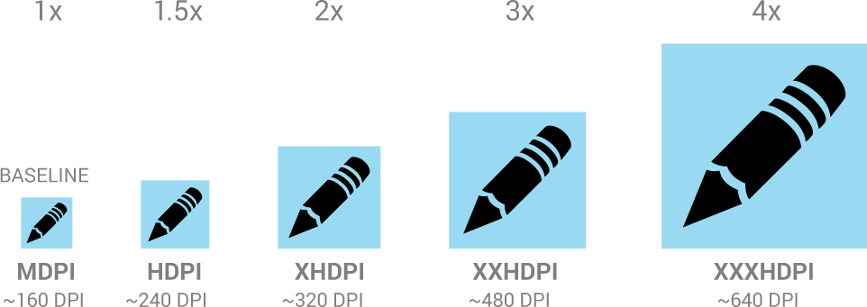
Besides size, another factor to consider is screen density: the quantity of pixels in a certain physical space measured in dots per inch (DPI), the dot being equivalent to the pixel. Screen density can be understood along the same lines as population density—the relation of inhabitants per square kilometer. In the case of apps, the inhabitants would be the pixels, and the screen would be the surface. A higher screen density indicates that there are more pixels available, and, therefore, improved quality in image definition and other elements that integrate the interface.
Density influences the designer’s work because it determines the characteristics of the document he or she will use to start work and the number of images that will have to be produced when the design is finished. The more densities supported by an OS, the more images needed.
has to be designed for each density in which the app will work. An edit icon, for example, is designed for all Android densities.
In Android, there’s an enormous variety of densities that cover mobile phones and tablets, offering a wide selection of visualization qualities. They are most often grouped as low, medium, high and extra-high.
iOS has only two densities: retina and non-retina. The first is the newest and is used in almost all recent devices, including the iPad Mini. Its visual characteristics are double the per inch pixel quantity of non-retina options.
Lastly, Windows Phone separates densities in medium, high and HD, depending on the device.
Preparing Design Files
When designing an interface, the first step is a white canvas, and it is here that we encounter the first doubt. What is the ideal workspace size?
Android recommends starting design with a document prepared for a standard base —a normal screen size with medium density —and then, when the time comes, separating the images for the developer. They should be scaled for higher or lower densities.
For iOS, it is most convenient to design for retina, the highest density. In Windows Phone, it’s best to design for the lowest density available, WVGA, and scale from there to the other two.
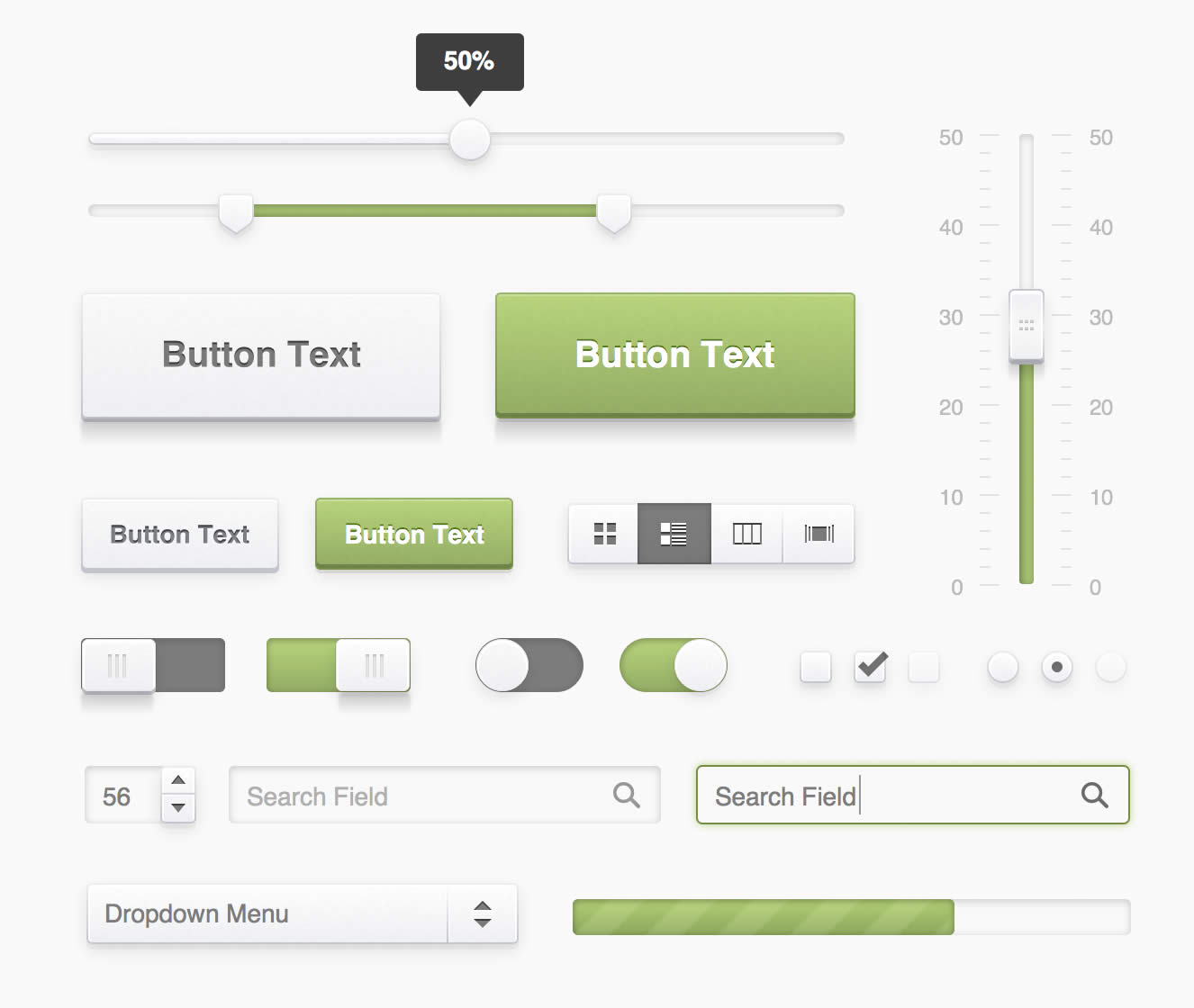
Luckily, designing from scratch is not always the norm. It’s possible to find design templates online for Android, iOS and iOS y Windows Phone, which contain interface elements that can be used to start with a base of visual components like buttons, bars and backgrounds. Most of these are vector graphics, meaning they’re easier to scale to different sizes.
Designing and Testing in a Mobile Device
An interface can look really great on a computer screen but become an entirely different beast on a mobile device, its ultimate destination. As work is being done, it’s best to consistently test the interface on a smartphone to assess visualization. Don’t wait until after the app is implemented and coded.
Getting used to performing tests and incorporating them into the design process will allow you to ensure that the size of the elements and fonts are correct and that sufficient contrast is present.
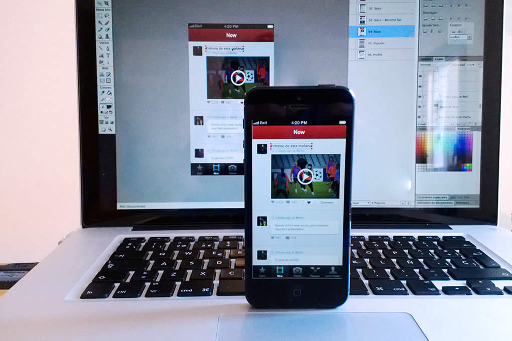
There is a wide array of tools that allow testing directly from a computer connected to a smartphone. For Android, there’s Android Design Preview, and for iOS, you’ve got LiveView. There aren’t any comparable tools available for Windows Phone just yet.
Image Slicing
Once the design is ready, the images included in the interface must be separated. Save each element in a separate file so that the developer can access them easily and begin bringing the app to life.
An Image for Each Density
When images are separated, different available densities should be considered, and a version for each should be created.
If the most common densities are covered, four different images for each graphic element should be created for Android. If the design has been created on a standard base, it will be necessary to do a few calculations in which the width and height of the images are multiplied so that they look good across densities.
To facilitate an easier design process, Android works with density independent pixels, also known as DP. Each DP is the equivalent of 1px in a medium-density screen and can be transferred to other densities by calculating the value for each case. For example, if we have an icon with a width and height of 20dp, it will have 20px in medium density, 15px in low density (20dp multiplied by 0.75), 30px in high density (20dp multiplied by 1.5) and, finally, 40px in extra-high density (20dp multiplied by 2).
There’s no need to get entangled in calculations, work with a giant calculator or go back to school to become a rocket scientist. There are tools available online that can perform these calculations for you7.
In iOS, the math is much easier: the images designed in retina should be transformed to half their size. As a trade secret, it’s important to consider that the width and height of the graphics designed for retina should be even numbers so that it’s easier to divide them by two later on.
In Windows Phone, images are scaled as vectors with .svg format. Therefore, they can be scaled by code to the necessary size. This method also ensures the optimization of images for Windows 8 apps, guaranteeing visual consistency.
When scaling images, make sure they maintain their quality and aren’t deformed or blurred. Sometimes, the imperfections found in a new size have to be adjusted until a sharp and well- defined image is achieved, in other words, pixel perfect.
Buttons
When it comes to buttons, it’s not a good idea to work with images that contain the complete shape of the button in its final size. Instead, it’s preferable to have images that can be enlarged to cover different widths and lengths without becoming deformed. With this method, it’s possible to use the same image for buttons of different sizes throughout the entire app. As a result, few images require redesign and export with every change.
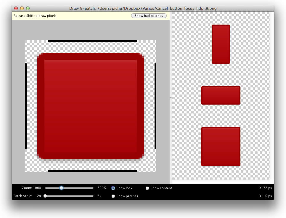
To improve work and gain control over the areas of an image to be enlarged, Android has made available a tool called Draw 9-patch. The final result is an image that, after implementation, will detect which areas can be enlarged and which should remain unchanged.
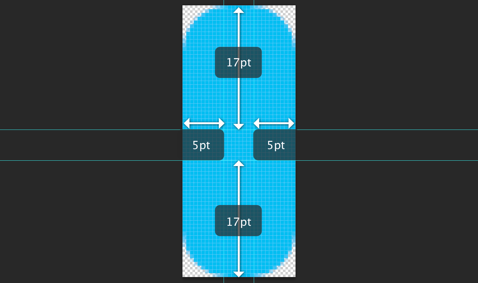
In iOS, the idea is similar, only there’s no need for an external tool. In a button with rounded corners, a security area can be defined that won’t enlarge, and the center of the button can be used to cover the height and width necessary. These values can be agreed upon with the developer and should be entered in the code when the app is being programmed.
It’s worth keeping in mind that buttons don’t have only one state. In general, design is performed in the normal state, but buttons can also be tapped or disabled, and there’s no hover state, as is the case with web buttons. For each situation, a visual variation of the image is required to highlight any differences.
Backgrounds
Backgrounds are not necessarily images with the same size of the screen for which they are designed. For example, a background with a texture or pattern can be the image of a module in the size needed that is then repeated by code as many times as necessary.
In the case of gradients, an image with the necessary height and width can be repeated several times. So, if there’s a vertical gradient, an image with the height of the screen and 1px of width can be exported and repeated horizontally until it covers all the available space.
In Windows Phone, a particular situation occurs: designs that are based in Panorama have a format, especially horizontal, that includes several screens.
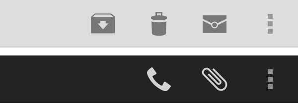
Tabs and Bar Icons
Before creating new ones, default icons that come with the operating system should be reviewed.
With iOS, the Apple Symbols font includes the icons that are most commonly used in the apps for iPhone or iPad. And in the case of Android, you may download a pack of official icons. Windows Phone also has a series of predesigned icons.
Whenever you need to create your own icons, you cannot lose sight of the visual style of the operating system. Maintaining consistency means the user won’t realize which icons have been
designed especially for the app and which have not.
In Android, images for menu icons, tabs and action bars must be designed with the necessary contrast according to the theme (dark or light) that was chosen to develop the app: .png
images with a transparent background.
Dialog icons must follow the graphic style of colors and
shades recommended by Android in its guide, and tabs must include the two states —normal and selected. There is a template available from Android that offers a guide and imitates visual style in each case.
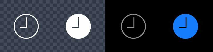
In iOS, icons have effects that are applied to the toolbar, navigation and tabs. All of those images are used as masks. Therefore, they should be white with anti-aliasing and a transparent background. It’s also important not to include shadows, and if bevels are used, they must be at a 90o angle, as if the icon were being illuminated by a beam on the upper part.
Default visual effects of the operating systems can be over- written if unwanted, as long as the images to replace them are provided.
In the case of Windows Phone, new images created for the icons usually follow the aesthetic the operating system proposes: minimalistic, flat shapes, without gradients or bevels. It’s best to choose white, since they will have the color of the theme chosen by the user. In consequence, the resulting file will be an easily scalable .svg.
File Naming
When working with many different images, especially for different resolutions, it’s important to be organized and consistent in naming exported files.
Working orderly is a huge advantage when you’re searching for images inside a project. The name should be enough to identify the function and context of the specific image.
In Android, a different folder for each density is recommended. Images will be saved there, under the same name, for each case.
As an additional help to folders, the images can be named with prefixes. For example, the icons can begin with ic_. Combinations of prefixes can even be used for more clarity on the image type. A graphic called ic_launcher_calendar.png will give you a pretty good idea about what it does and where it goes.
Exported images for iOS also follow a special naming convention, depending on whether they are for devices with or without retina. In the first case, @2x should be included after the name. For example, we would have the image calendar@2x. png for retina and calendar.png for non-retina. If the file is for iPad, the suffix ~ipad can be added at the end to differentiate
it from iPhone images.
In Windows Phone, if scalable .svg images are created, it’s not
necessary to have different versions. However, when working with .png images, a suffix should be added at the end to indicate the density of the device, such as _VGA, _WXVGA and _720p.
Communication
In order to ensure correct implementation, the designer and the developer must communicate constantly and fluently.
The developer may have doubts about the sizes of graphics and fonts, margins, the use of the grid, missing images or, simply, things the designer has overlooked or hasn’t considered. To reduce uncertainties, especially when working remotely, the designer should prepare a series of visual documents that facilitate interpretation.
In the document, screens of the app can be displayed, preferably those that are most complex or that mark important differences and changes. By means of lines and markings, the different sizes of the fonts and spaces in between visual elements may then be indicated.
Documents and interpretations aside, questions and concerns are likely to arise. Designers and developers must work together to find the best solutions.