
The Principles of User Experience
Each operating system has its own identity, which is reflected in the appearance and behavior of each of the elements within the interface. Such elements reveal the unique personality traits of each operating system, the very essence that sets the experiences they offer apart.
Not all interfaces share the same fundamentals, which are manifested in interface design. The following concepts are considered key elements of operating systems and the apps they contain.
Simplicity
Visual simplicity is directly related to usability. It implies a certain amount of minimalism and demands that the elements present in the interface have well-defined functions that contribute to an app’s objectives and are of true utility for the user.
Mobile phones are not ideal devices for showing a lot of information on a screen. Thus, simplicity also means managing visual economy and using sound criteria to determine what to include in design. Too many elements can overwhelm the user, so whatever appears on screen should be necessary within a specific context.
Creating a simple design is, paradoxically, pretty complicated, but it yields enormous benefits for the app’s user experience.
Consistency
An app is composed of many different screens. At the same time, it functions within an operating system with certain visual and interaction characteristics. The Android, iOS or Windows Phone user is already familiar with the OS and expects apps to behave in a determined manner.
Consistency is about respecting the user’s knowledge and habits not only inside the app, but also in relation to the rest of the OS. This favors the intuitive use of the app and allows the user to foresee behavior without much effort.
The existing relationship between appearance and behavior must also be consistent. The visual aspect of a certain interactive element, such as a button with an icon, can lead the user to expect a specific behavior based on how it looks.
For example, if a button is used for the delete action in the operating system, the user will expect to have the same effect inside the app. Fulfilling that expectation means having consistency.
Intuitive Navigation
Another aspect that should be carefully considered in app design is how content is navigated. Users should have a clear, easy understanding of how to get around in the app.
Intuitive navigation is also related to consistency. Each operating system has its own set of elements, such as buttons, tabs and panels. Using them correctly will enable the user to recognize them with ease, thus getting from one section to another.
Likewise, it is essential for the user to know and foresee what will happen or appear after tapping a button. Intuitively knowing where he or she is within the content of the app and knowing how to go back are important factors that benefit users significantly. Intuitive navigation enables a fluid and effortless use of the app.
Interaction and Ways of Holding a Mobile Device
Mobile device app design should take into consideration the way in which users hold their phones. Similarly, which fingers interact and how they are used have an incidence in interface design and condition the location of interactive elements on the screen.
Even though the user can hold the phone in several different ways, one of the most common is holding it with only one hand, something that can be liberating (since it leaves the other hand free) but also conditioning, because it attaches a lot of responsibility to the thumb for interaction.
Hence, the anatomical characteristics of the hand determine which areas of the screen can be reached with the most comfort. The Rule of Thumb refers to the screen surface the thumb is capable of reaching without too much trouble and gives us a few clues as to how to hierarchically organize the elements of an interface.
For example, the most frequently-used buttons should be positioned on the lower part of the screen, where they are easiest to reach. Meanwhile, controls that are generally avoided, such edit and delete, are located elsewhere, with more restricted access.
(image: 7_uso-movil.png caption: FIGURE 7.1. According
to the way a smartphone is held, the thumb has more or less difficulty in accessing certain areas.
As Josh Clark explains, the location of buttons and other controls on the lower part of the screen shouldn’t be only a matter of convenience, because locating them in that area also avoids covering them with the hand when moving over the mobile phone. This concept was already contemplated in everyday items like iPods or calculators, where the movement of the hand generally did not interfere with the visualization of data.
However, each operating system uses screen space differently, and that use also conditions applications. For example, iOS locates tabs within the comfort zone of the thumb, allowing simple shifts between content. Meanwhile, Android uses tabs in the upper area that are harder to reach but avoid conflict with other buttons, such as the back arrow, located on the lower part of the screen. Windows Phone is a similar case.
With larger phones in which the screen exceeds four inches, or for performing more precise tasks like writing, it is common for users to hold the device with both hands. In such cases, one hand is dedicated entirely to holding the phone and the other, generally using the index finger, taps and gestures with more liberty and precision.
Incidence in Device Orientation
Taking into account a device’s orientation when an app is being used means making the most of each scenario. Generally, smartphones are held vertically, while in the case of tablets, it is common to go from portrait to landscape more frequently.
In smartphones, landscape orientation is used largely in situations that require making the most of the entire screen. Holding the phone horizontally provides space for a bigger keyboard and more surface to tap keys for more comfortable writing.
It’s advisable to design for both orientations so that users aren’t forced into only one version. However, it is also necessary to evaluate whether it is really worthwhile for the app, taking into consideration that designing a landscape version doesn’t mean directly transferring each element to the most similar position in the portrait orientation. It means taking full advantage of the space available in landscape mode, relocating and rearranging graphic and interactive elements to improve usability.
Patterns of Interaction
According to Martijn van Welie, «an interaction pattern is a short hand summary of a design solution that has proven to work more than once. Please be inspired: use them as a guide, not as a law.»
Interaction patterns are tested solutions that answer common design problems. Using them as a guide can help expedite and simplify design work in an interface. Using interaction patterns also ensures that users will find familiar elements in the interface, making them feel more comfortable and confident when using the app.
Navigation
Simple and consistent navigation is an essential component of user experience in an app, involving numerous questions. How will the user move around the app? With menus, or with the content itself? What happens when there is a notification? How can the user go back?
Tabs
Tabs can be used to filter content or move among screens that, according to information architecture, have a hierarchy that indicates where the user is and what’s next.
Best practices indicate that it’s always necessary to indicate the tab selected. Order and location must be maintained and can’t change from one screen to another, and they mustn’t be used to include actions besides navigation.
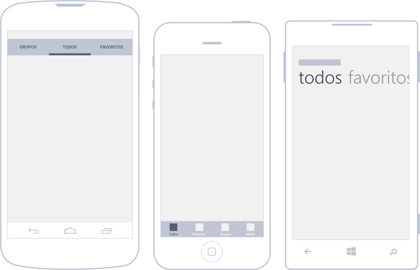
Android uses tabs in the upper part of the screen (just below the action bar), which, unlike iOS, are generally used for the second navigation level. It has two different tabs: fixed (always visible) and sliding (the user can see the current tab and two adjacent ones). In any case, Google suggests applying a golden rule of using no more than five to seven tabs.
iOS, on the other hand, always locates them in the lower part of the screen. In the iPhone, it is possible to visualize a maximum of five tabs. If more are needed, the last tab will read more, and house less relevant sections. According to Apple’s official guides, tabs should always be visible and are best used for organizing the most important content within the hierarchy.
Windows Phone goes against the visual metaphor of tabs with something called pivot control, even though the function is the same. They are always located in the upper part of the screen and, because of their large size, play the part of title and tab at the same time. The recommendation is to use them in complement with and as subordinates of the Panorama menu, which navigates higher content hierarchies within the app.
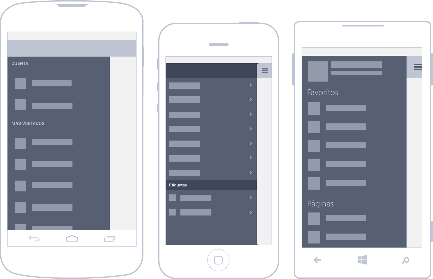
Lists
Depending on how you look at it, all vertically-arranged structured content can make up a list. This way of showing as many items as necessary allows the user to tap any of them to obtain complementary information.
Lists can show texts or images, but it’s always important to arrange their content hierarchically. For example, in an email app, it’s normal to give more importance to the sender than the subject, date received or first lines of the message. Arranging the elements inside a list helps visualize the name of the sender —in this case, the most relevant piece of information —at a glance.
When there are several elements, an index system can be added to complement navigation as you scroll through the content list.
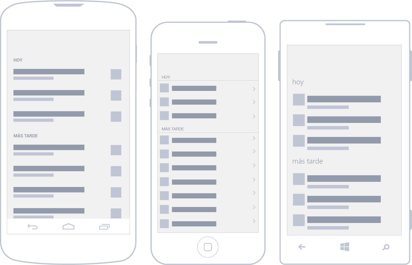
In Android, the use of lists is widespread. Google’s style guides recommend grouping related content, like in the settings page of the operating system, for better comprehension. As users, we are able to memorize only a few elements in the short term.
In iOS, lists also occupy the entire screen width. While some pile one item over another, there are also grouped lists that allow for the division of content into blocks separated by vertical spaces. It is common for iOS lists to have an arrow on the right of each item.
In the case of Windows Phone, the List View shows a list of items that may contain images and texts, and it adds the possibility of showing data in a grid.
Image Gallery
Image arrangement is determined by the grid proposed by each operating system. When they exceed the space available, a crop is performed (generally square) of the images on display.
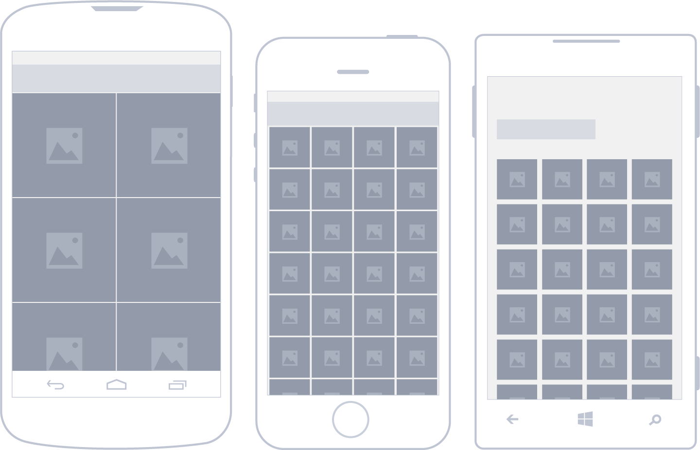
Android is a particular case. When showing images in the grid view, it’s possible to use a horizontal scroll. When this happens, it’s advisable to show a small slice of the following images.
Drawer Menu
This pattern, made popular by Facebook, allows users to switch rapidly between an app’s screens. With the tap of a button, a side list with hidden content appears. Another way of getting to the list is sliding the finger from the left side of the screen.
The use advantages of this pattern are clear: better use of space and, once the list is displayed, a comfortable way of navigating content. But this format isn’t without its drawbacks, as it forces users to tap the button and display the panel to get a full view of the options available.
Up to now, the only operating system that has standardized the use of drawer menus in official guides is Android. It has been recommended for the highest navigation levels of the app, or when menu options are not directly related.
There are many iOS apps that use the drawer menu as well. A nice example of this is Path, even though it’s not recognized by design guidelines. The social network began implementing this type of navigation with its second version.
However, drawer menus are quite uncommon in Windows Phone. In fact, the Facebook app is one of the few that uses it to navigate content on such devices.
Back
Users who are accustomed to the web will find this to be a familiar way of navigating. As users progress in content, it becomes necessary to have a way of returning or going back to upper levels. In the mobile world, with screen-to-screen navigation, the use of the back button is very frequent.
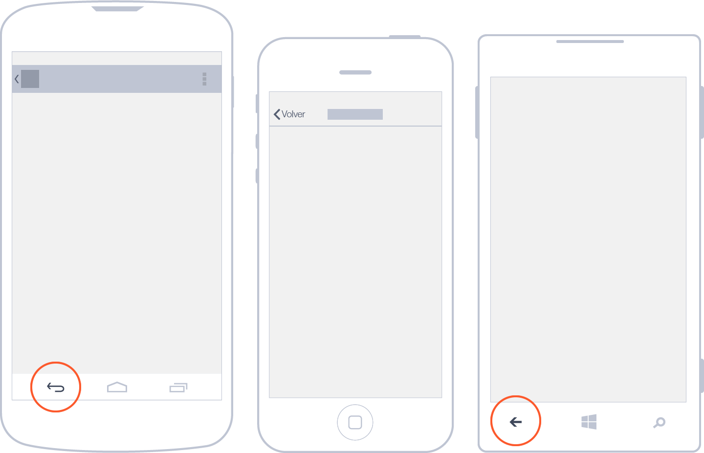
In iOS, this button is inside the navigation bar, located on the upper-left corner with a label that displays the title of the previous page. Here, navigation among pages is hierarchical.
In the case of Windows Phone, the physical button of the telephone outside the app interface is in charge of managing this way of navigating content. In fact, the interface of the app should not contemplate the use of the button, leaving it entirely to the operating system.
Android Confusion: Up or Back?
From its fourth version and onwards, Android has proposed a new way of navigating an app’s information structure based on the hierarchical relationship between screens. Thus, it has introduced the up button. On the app’s home screen, it shouldn’t appear, because there are no superior levels.

Meanwhile, the back button is physical in some smartphones and incorporated into the virtual navigation bar in the system’s interface in others. It is always visible and used to navigate to the previous screens visited by the user, in chronological order. If the button is tapped at the top level of the app, the user will exit the application.
These two buttons work in a complementary manner, but they can also represent conflicts. Both should be kept in mind in order to ensure excellent user experience.
Windows Phone and Panorama Navigation
Panorama is an exclusive pattern that belongs to Windows Phone and offers the possibility of navigating content horizontally, as if each of the screens were next to one another. Moving through the screens gives a sensation of content continuity, supported partly by the use of background images.
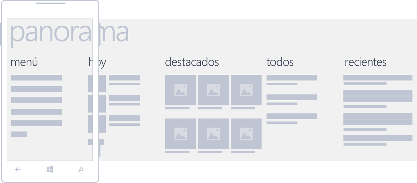
Panorama is recommended for the superior level of navigation, as if it were a home page. From there, the main parts of the app can be displayed along with content previews.
This pattern is composed of a background image, title (generally, the app’s name or logo), section titles and previews.
Actions
What actions are necessary right now? What actions would the user expect to find after accessing the screen? Which of the actions is more important? These are some of the questions that should be asked when defining the actions that will be found in each screen of the app.
Most actions can be performed only on the determined pages where they make sense. However, there may be exceptions, when it’s necessary for an action to be visible all of the time. If this is the case, important actions should be highlighted in a very obvious way. This is what happens in Twitter with the action to compose a new tweet, which is present in the interface most of the time.
Actions may be located in different places according to their hierarchy and function, where the more important are visible and the less important are hidden. No matter where they are located, their position should be consistent across different screens and apps in the operating system.
Action Bar
In all systems, the summary of actions that can be performed is represented by means of icons. That’s why the correct selection of graphic resources is fundamental.
In Android, action buttons are found in the upper right area of the interface. There may be a few exceptions in which they’re located in the lower part of the screen, separated from navigation. It is essential to arrange actions according to their use frequency. The screen’s width will determine how many items can be shown: from two in the smaller mobile devices to five in tablets.
In the case of iOS, the most common location is the lower area, even though in the iPad, action bars are located on the upper right.
Likewise, Windows Phone always uses the lower area of the screen to locate the actions that can be performed. In fact, only the most common actions can be displayed (a maximum of five). It may also be the case that there is nothing to highlight, in which case, it’s convenient to use the minimized bar.
Action Overflow
Additional and less frequent features are discovered by means of progressive disclosure. Basically, they are hidden most of the time until the user claims them.
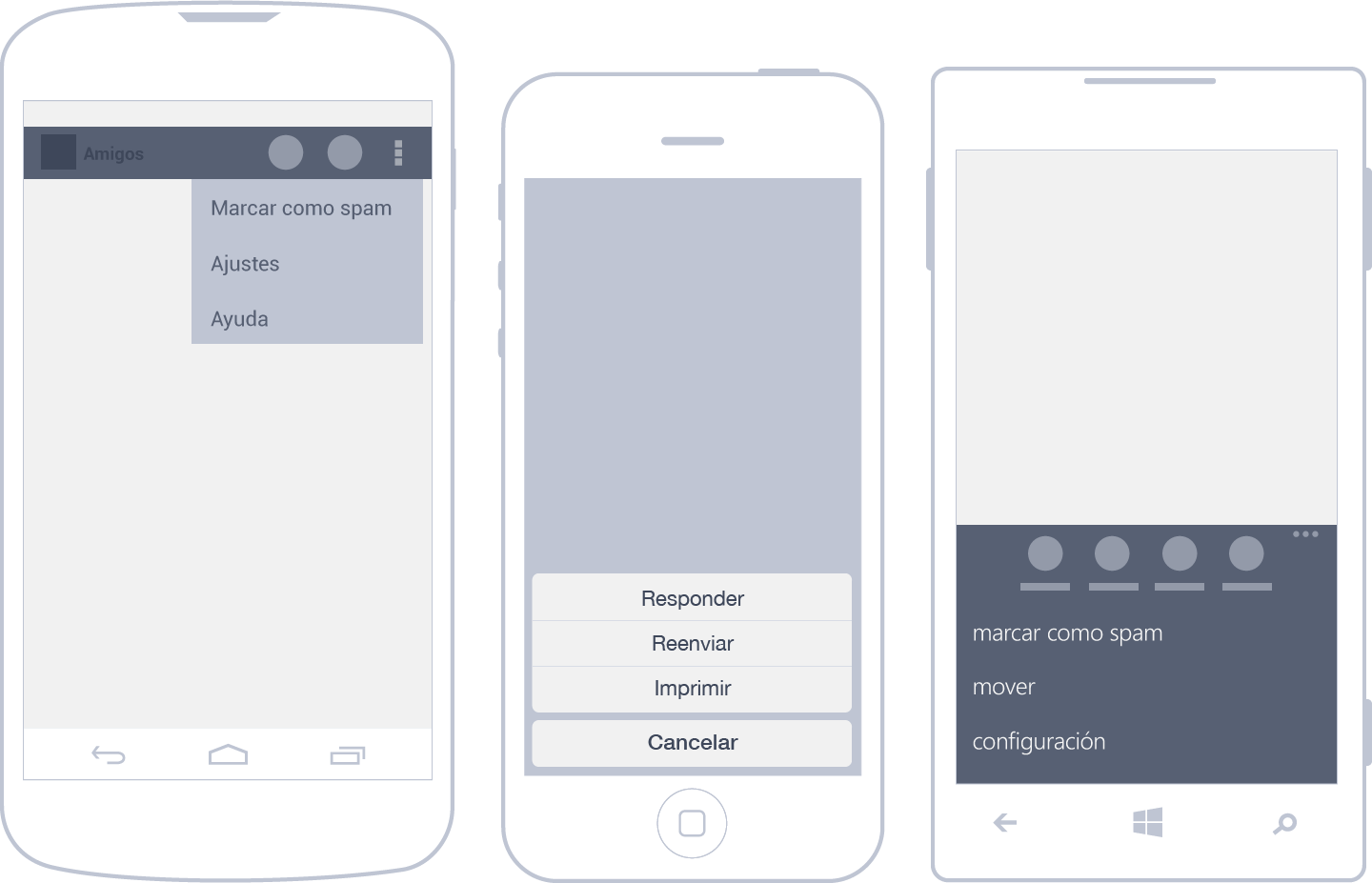
In Android, the options that don’t fit into the action bar are automatically displayed as overflow actions. They can be accessed through a button with an icon of three vertical squares that opens them in a list format.
Apple’s proposal is to group related actions, initially hidden, and then show them in the button list format.
In Windows Phone, as well as in Android, additional actions are located below the actions bar and are indicated with dots that, when tapped, reveal hidden options in a list format.
Shortcuts
There are certain actions that should be readily available so that users can achieve their objectives quickly, for example, accessing actions associated to items in a list or grid without having to navigate deeply to find them.
In the case of a music app, it is bothersome if adding a song to a playlist requires deep navigation. In such situations, it’s advisable to use shortcuts to simplify repetitive actions.
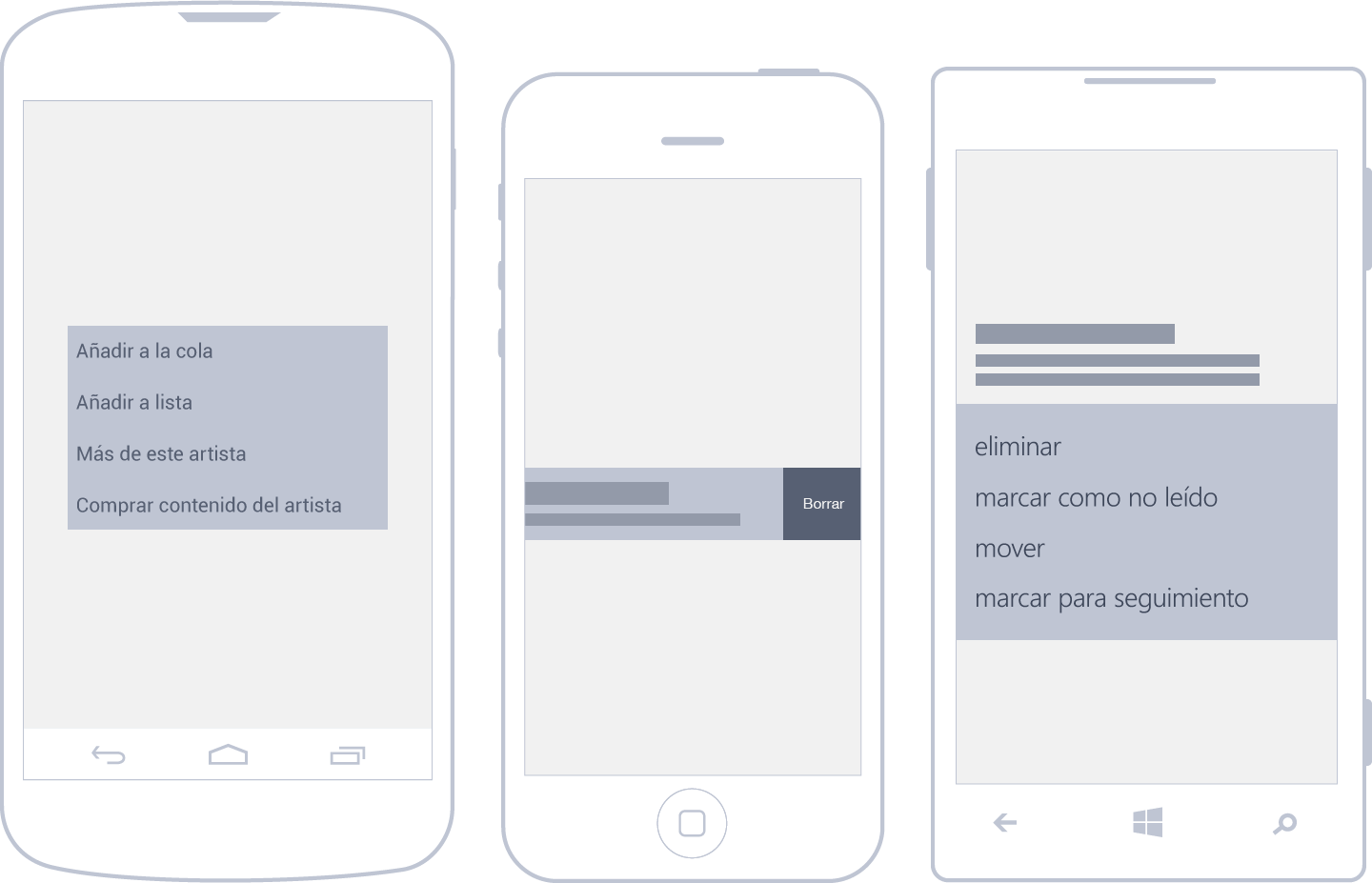
In Android, before version four, it was possible to access shortcuts by tapping an item continuously, thus displaying a menu of possible actions. Currently, that gesture (long press) is recommended only to access the edit mode in a list. Meanwhile, it’s possible to create a shortcut by means of a triangular icon located at the bottom of the elements that have these kinds of activities associated with them.
A pretty common example of a shortcut in iOS is when there is a need to eliminate an item from a list. A horizontal swipe is performed over the row to delete it. On the other hand, related actions are located in situ, on the item itself.
In Windows Phone, shortcuts are unfolded in a contextual menu format when holding the tap on an item.
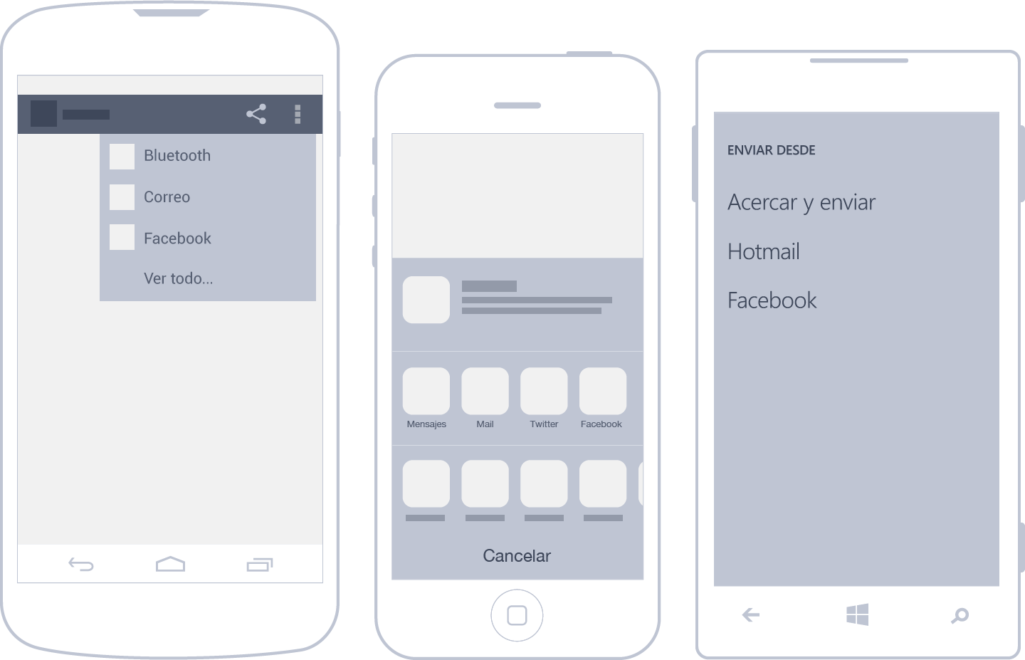
Sharing
Sharing is probably one of the most popular actions today, via Facebook, Twitter, text message, etc. Operating systems have taken note and integrated sharing options accordingly.
Search
Taking into account that one of the main uses of mobile devices is content consumption, the search tool is an essential way of finding content. In the case of apps that display loads of data, search may even be the main feature.
A search can be performed by introducing text—the most common method—or by voice. Whenever possible, it’s best to show results as the user writes out the inquiry in order to improve experience. Ideally, the wait time from data input to results should not exceed one to two seconds.
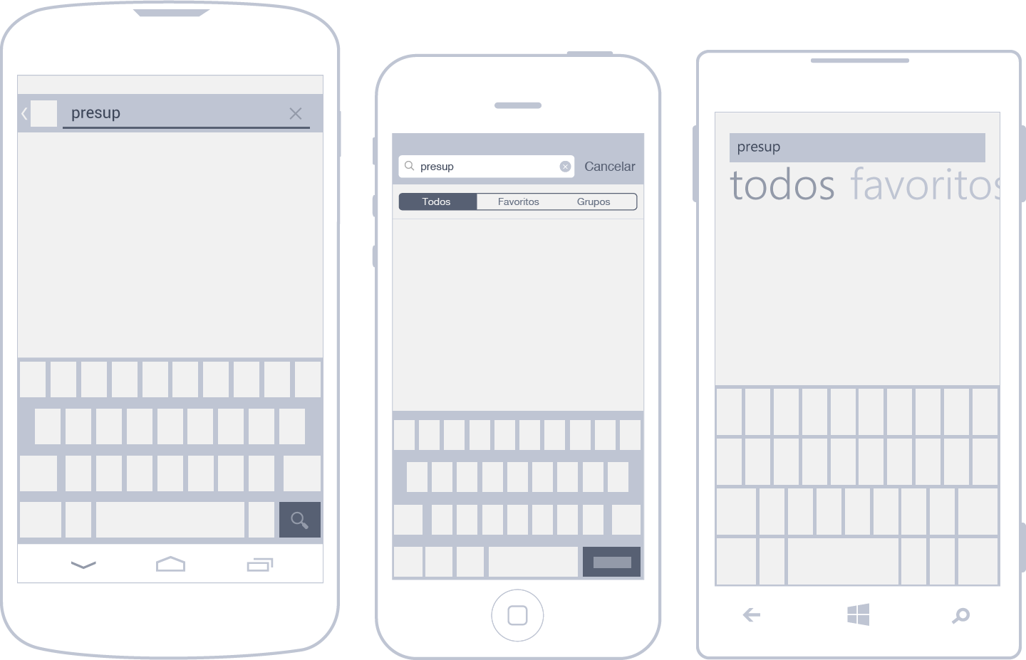
Android makes the search option available from the action bar. If search is an important feature for the app, as in the case of Dropbox5, it should have the first position in the bar. When tapping search, the upper bar is modified and becomes the search bar.
In the iPhone, it’s normal to find a search field over lists like Contacts and other apps. Within the text field, filters may appear for refining complex searches.
In Windows Phone, search is treated as a separate action, available in the action bar and carried out through a distinct page where text is introduced and results are listed.
List Editing
The user may need to modify several elements from a list simultaneously. The flow of accomplishing this is quite simple: the elements in question are selected, and the corresponding action is performed.
For example, to add a tag to three received email messages located in an email list, they must first be selected, and then, a desired action is chosen. So far, nothing revolutionary.
Now comes the interesting part: the way of selecting elements from a list varies considerably from one OS to another. Let us explain.
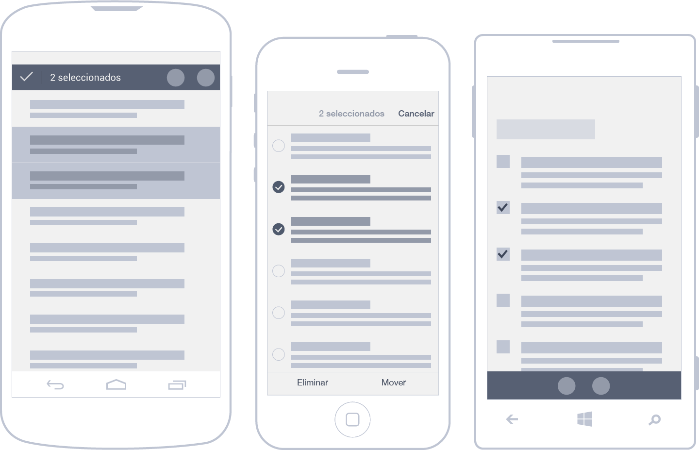
To make a multiple selection in Android, an element must be long pressed. Once the first item is selected, the action bar changes, indicating how many elements have been selected and what actions are available. To leave this view, Android proposes the use of the check button.
In iOS, list edit is activated with the edit button, located in the navigation bar. As such, the selection is shown together with related actions. In order to exit the view without applying any changes, in the same place where access was granted, a cancel button appears.
In Windows Phone, there are two ways to access a selection. It can be done with the action bar, where the user finds the select option, or by using a shortcut, which is very practical once learned. The trick is to select the left side of the first item so that the list is shown in edit mode, allowing for the selection of several items at once.
Dialogue Boxes
There are particular cases in which users must be interrupted temporarily to prompt a decision or better explain something that has happened before continuing on with a task. When dialogues are visible on screen, it’s not possible to do anything else in the rest of the app.
When boxes only contain notices that don’t require a decision, they are only informative and have one button to be closed. It’s advisable to limit their use for serious or transcendental messages that absolutely cannot wait.
Otherwise, dialogue boxes are used to communicate to users the need to make a decision, with two or more options available.
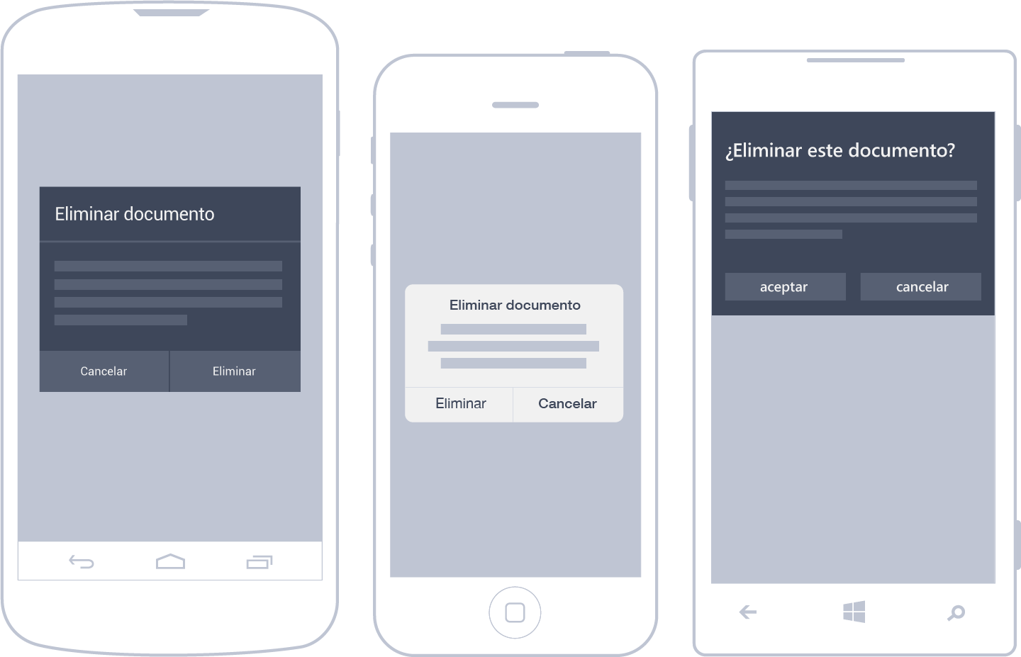
Android uses dialogue boxes extensively. Requests can be as simple as OK or Cancel or complex designs with a form inside.
In iOS, dialogue boxes are located in the center of the screen, most often with one or two buttons in the lower area. If there are more than two buttons, they appear in piles. These dialogues are usually so simple that they only have a title with a short
description.
In Windows Phone, dialogue boxes appear in the upper area.
They generally take up only part of the screen but, in exceptional cases, occupy it entirely.
In-App Notifications
What is the app doing? How do I know if the action has worked? Is it over? Do I have to do anything else? These are questions that plague users when there is no visual confirmation of their actions.
To mitigate uncertainty, it is advisable to display explicitly how things are progressing and what will happen next. These kinds of messages are presented in small announcements that appear after a few seconds.
Unlike dialogue boxes, notices don’t require the user’s intervention and don’t interrupt workflow.
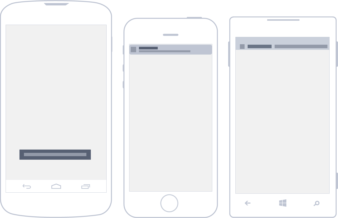
Android incorporates toasts. Visually, a toast consists of a small, rounded rectangle in black, located in the lower area of the screen and above any other element in the interface.
This notification appears for a short period of time, with text (generally only one line) that provides the user with feedback—an example being while an app is saving changes.
Because it’s a kind of warning that can go unnoticed, it is used to communicate messages that are not critical.
iOS and Windows Phone don’t have a concrete solution similar to the Android proposal. Notices inside the app are left to the designer’s criteria, for example, by means of external libraries
Data Input
Data input on a mobile phone can be tedious when fields require the use of the keyboard, an element that occupies a large part of the screen and makes navigating difficult when introducing information.
All operating systems have developed different keyboards, depending on the kind of text to be entered.
If keyboards can be avoided, it is often better to use other alternatives, such as sliding menus, drop-downs and checks. Alternatively, there are also hardware components, such as location sensors, cameras and microphones, which can also be used to input data into an app.
An example is Google, which offers the option of voice searches and utilizes geolocalization.
Gestures
Tapping is the main input method of modern mobile phones. Everything depends on the user’s hands, which manipulate the elements directly on the screen. Action and reaction happen in the same place, similar to the real world.
When screens with multiple gesture support were introduced, it seemed as though tactile interfaces were going to get considerably richer. The reality is that, a few years later, it can’t be said that the most complex gestures have been extensively adopted by users. This is, in part, because the more complicated the gestures, the fewer people can perform them.
On the contrary, simple gestures such as tap, drag and swipe, which require only one or two fingers, have been assimilated very well. Users find them natural and familiar.
You can take advantage of the use of gestures when designing apps. They should be considered the means for all actions and content navigation. Here, it’s also important to take advantage of the user’s previous knowledge and to be consistent with the operating system.
It should be possible to perform the app’s basic actions with simple gestures to ensure that users can perform them, leaving the most complex gestures as an alternative to interact with the app’s interface.
Each OS has attempted to impose its own conventions, but luckily, there are some gestures that are shared by Android, iOS and Windows Phone. Below is a list of the most common gestures and their uses:
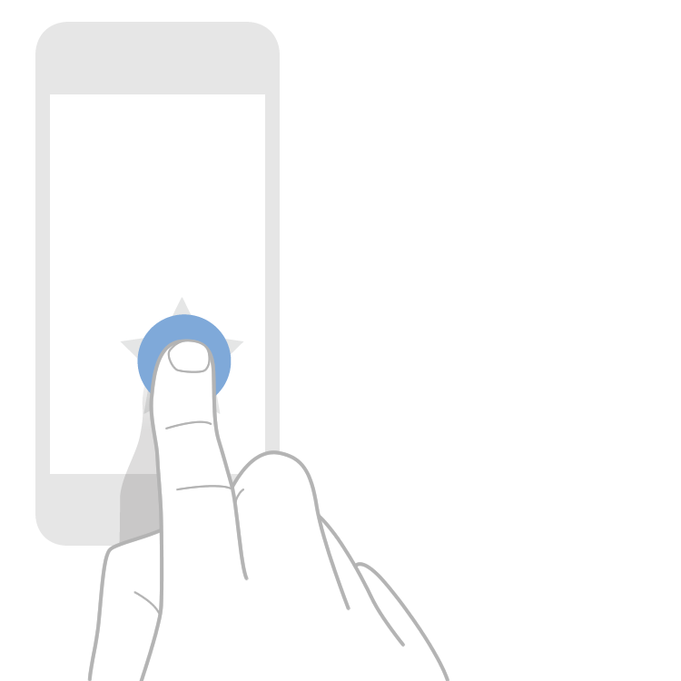
Tap
Tap the surface with the tip of the finger.
- Android: Selects the main action.
- iOS: Selects the main action.
- Windows Phone: Selects the main action.
Drag
Move a finger over the surface without losing contact.
- Android: Delete by dragging horizontally in lists.
- iOS: Showing a delete button by dragging horizontally in lists. Move items in lists.
- Windows Phone: Change to other tabs or sectors of a Panorama view.
Slide
Slide quickly and without stopping the tip of a finger on the surface.
- Android: Browse content. Change to other tabs.
- iOS: Browse content.
- Windows Phone: Browse content. Change to other tabs or sectors of a Panorama view.
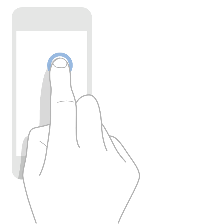
Long press
Tap the surface during a long period of time without moving the finger.
- Android: Enter the list edit mode.
- iOS: Show a tooltip. Increase the visible content under the finger.
- Windows Phone: Show a tooltip without selecting the element.
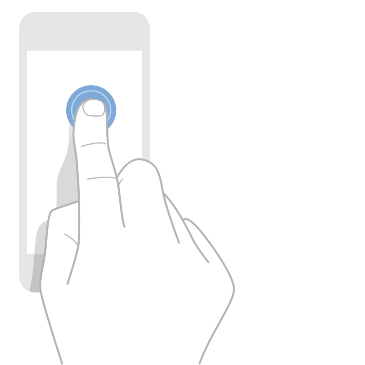
Double tap
Tap the surface rapidly twice with the tip of the finger.
- Android: Zoom in and zoom out. Select text.
- iOS: Zoom in and zoom out.
- Windows Phone: Zoom in and zoom out.
Pinch and spread
Tap the surface with two fingers, spread and separate the fingers.
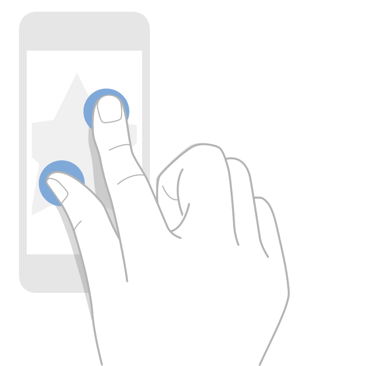
- Android: Zoom in or zoom out.
- iOS: Zoom in or zoom out.
- Windows Phone: Zoom in or zoom out.
Rotate
Tap the surface with two fingers, spread and separate the fingers while rotating the wrist.
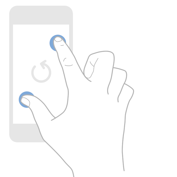
- Android: Rotate an image or a map.
- iOS: Rotate an image or a map.
- Windows Phone: Rotate an image or a map.