
User Research
Getting to know users makes it possible to design an app that takes into account motivations, needs and problems as the starting point for building a proposal. This knowledge is not based on assumptions and theories; on the contrary, it’s based on research that helps determine the user profile for the app. Personas and User Journey are some of the methodologies used to achieve this.
Personas
The concept of Personas was coined by Cooper, a San Francisco- based strategy and design company1. It is a very useful tool that is utilized constantly in interaction design today. Its function is to define user models and archetypes for design.
In order to create Personas, real research is needed—you can’t just rely on conjectures. Many possible users should be analyzed in order to determine the behavioral and thought patterns they share, avoiding their individual characteristics and focusing only on what they have in common.
The end result of this investigation is a visual representation in which the user is modeled after the data collected: the Persona will have a face, name, story, ambitions and objectives.
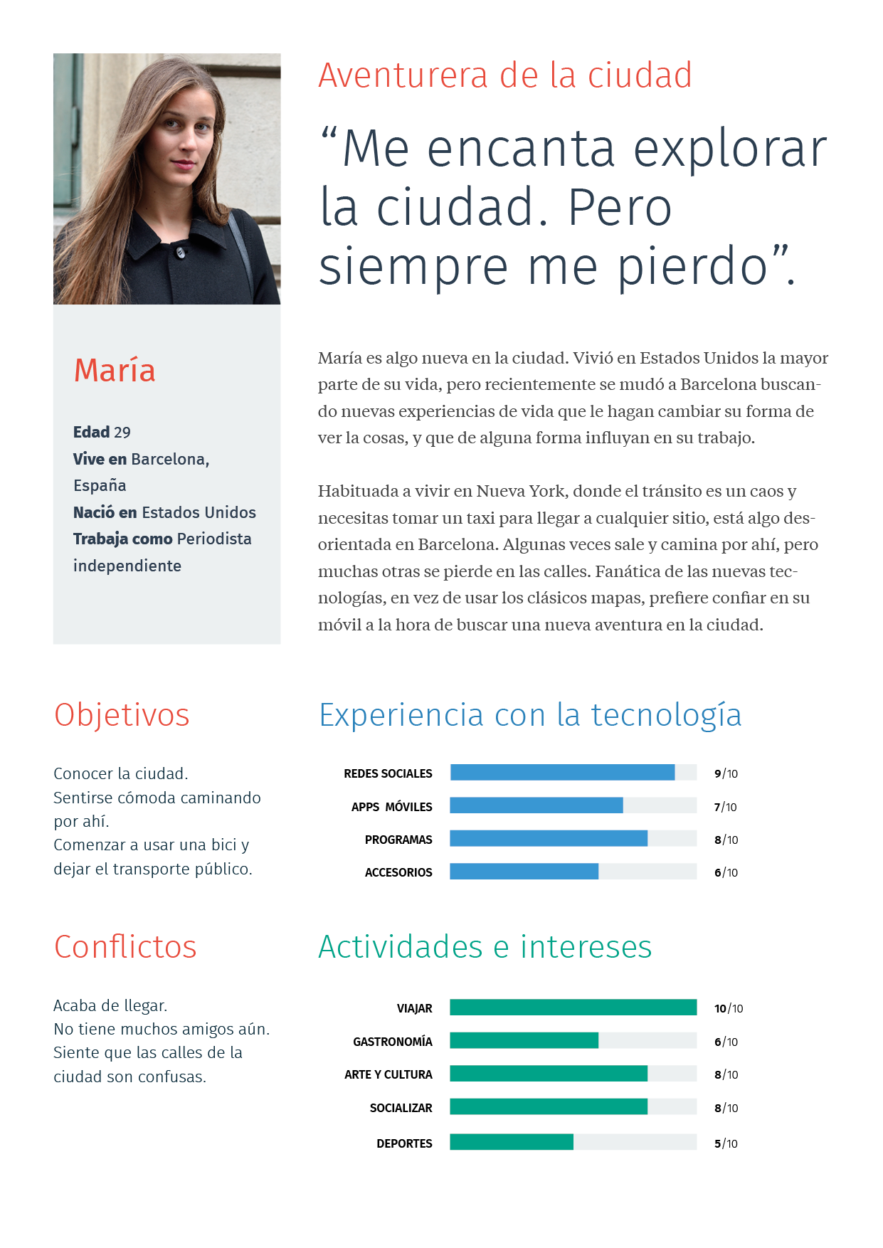
Many different types of Personas can be determined for an app, but for this exercise to be useful, there shouldn’t be more than three. Ideally, the project should focus in one main Persona.
User Journey
Considered individually, Personas can help us to understand user models. But we also need to know how those models behave and feel when they have a certain goal in a specific context.
It is here that the User Journey intervenes, a way of visually comprehending, from beginning to end, the process that a Persona embarks on from the moment a need arises to the second that need is satisfied, using the app.
To make things clearer, here’s an example. Someone who’s lost can use a mobile phone to find the way home. To create a User Journey based on this scenario, you must consider the entire situation, from the moment he or she gets lost, before opening the app, to the moment he or she achieves the goal of finding the way, going through each of the actions performed with the app.
This process can be visualized graphically in a linear representation. Stages may be delineated to detect user emotions as well as the difficulties encountered with each step and the actions required throughout (an example being search). Thus, it is possible to detect the moments when design should focus on solving interaction problems in order to obtain a more usable application.
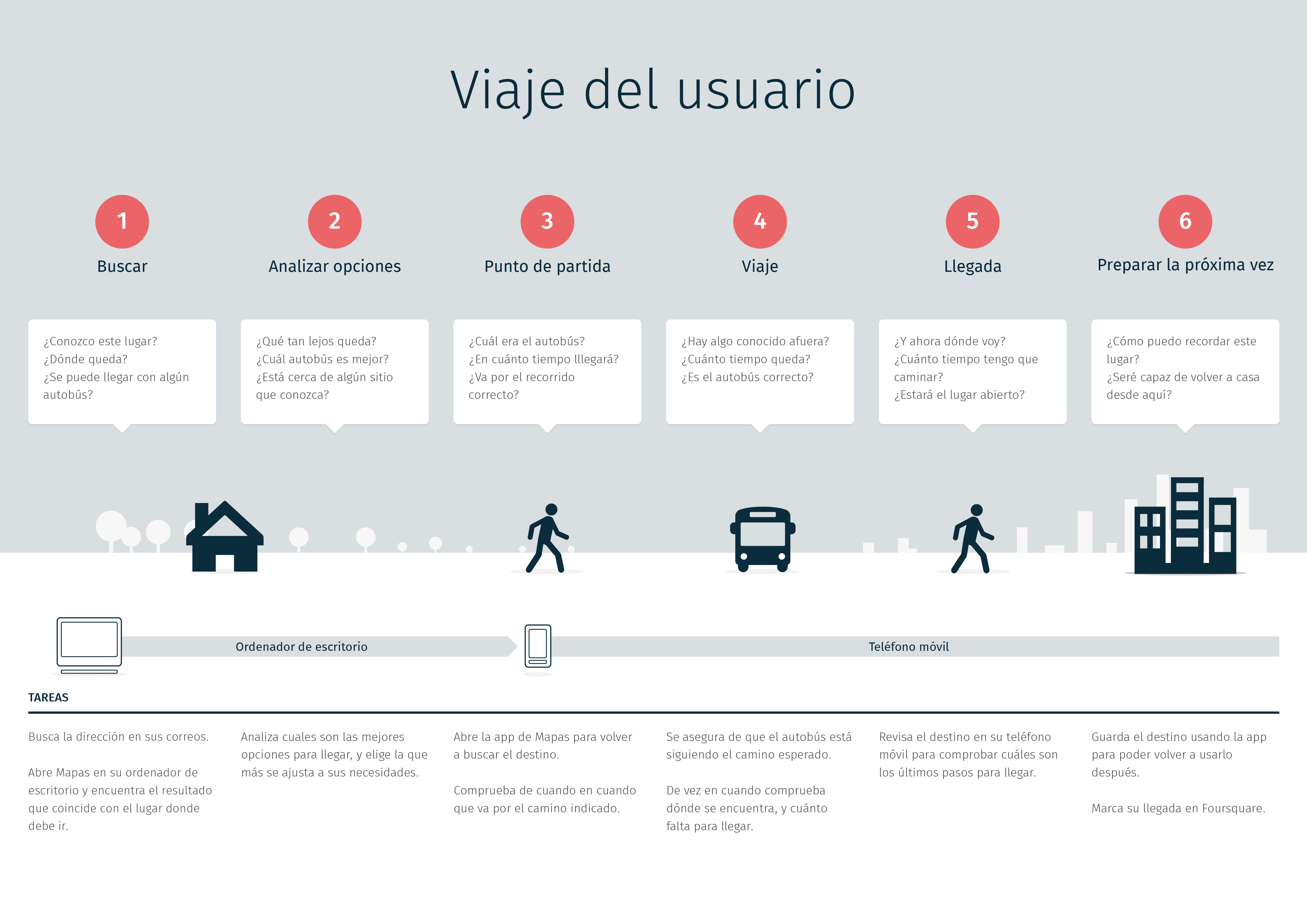
User Journey is also useful for laying out the preliminary foundation of information organization and defining features without taking into account a rigid or hierarchical structure.
Functional Definition
All actions and interactions needed in order for the user to achieve his or her goal are translated into features that an app should have. By following the User Journey, it is possible to detect needs at each stage and the tools required to move on to what’s next.
Using the same example of the directions-providing app, the fundamental features would be: determining current location, searching for destination address, and choosing transportation options. Each action is equally important and serves the app’s overall purpose.
An infinite number of complimentary features can be added, for example, saving a destination. Each time a new feature is added to complement the main goal, it is essential that the feature be truly useful, taking into account Persona and context of use. We should never forget what is expected of a mobile phone in each particular case, in this example, the capacity to solve a specific problem quickly.
Each feature that is added also represents more time for development and more complexity, which is why it’s important to decide carefully, in each case, if it deserves to be included. You don’t want to end up with a product that is so saturated with features that the experience is ruined. It’s always preferable to do less well.
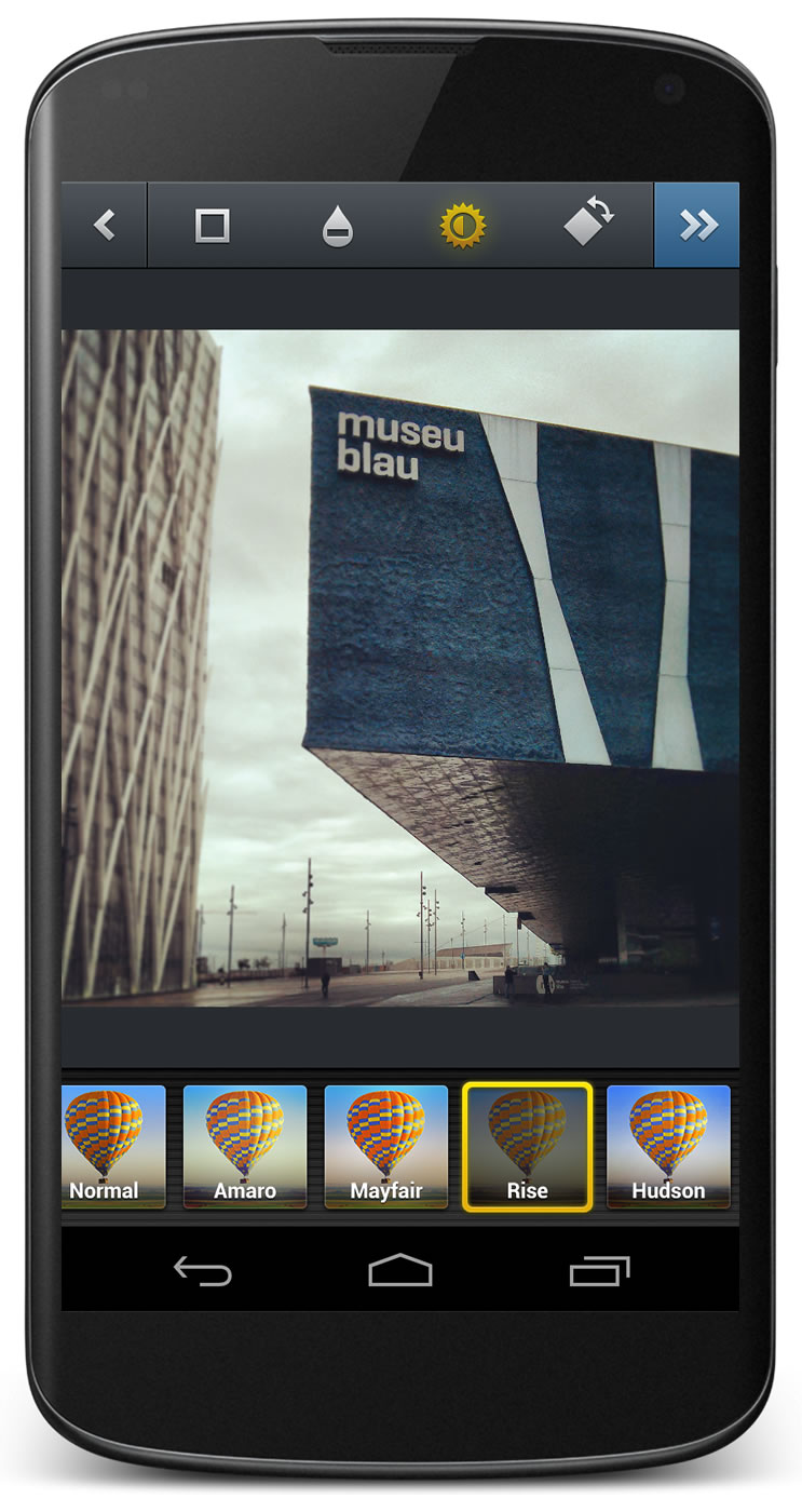
For example, popular photography app Instagram became what it is today after paring down a series of unnecessary features. Now, its complementary features, such as filters, represent real value for users, allowing Instagram to differentiate its product from the rest.
Proposing a Vision
Users often ask for features they think should be included in a product that has already been built. This can be a double-edged sword, because what is useful for one user may not be useful for everyone. In such cases, it’s fundamental to strike a balance between user opinion and the proposition.
Information Architecture
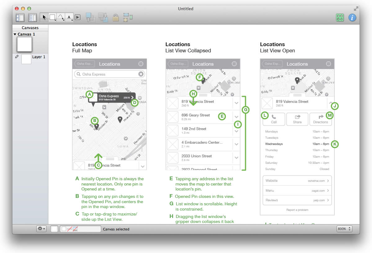
Information architecture is a way of organizing the content and features of the entire app in such a way that they can be found quickly and easily by the user. In a global sense, information architecture considers the relation of content on different screens and, on a more particular level, the organization of content within the screen itself.
After having defined User Journey and app features, an architecture diagram determines the screens and features required at each stage. Business aspects and technological requirements may also be taken into account.
One way of visualizing architecture consists of representing each screen with a rectangle —in apps, generally more vertical than horizontal —where the connections between rectangles indicate a way of navigating from one screen to the next and the means of each action.
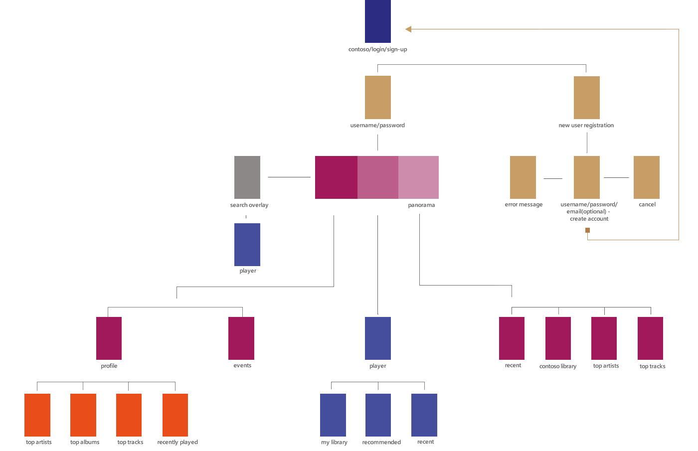
This diagram helps with the study of an app’s complexity at the glance, allowing you to analyze different levels of depth and to visualize and understand the relationship among content in a much more organized way. Whatever is defined at this stage will have a direct impact on the kind of navigation chosen afterwards.
Wireframes
A wireframe is a very simplified representation of an individual screen that allows us to have an initial idea of the organization of elements, identifying and separating those which are informative with those that are interactive.
A wireframe is to an app what a blueprint is to a house. This blueprint shows spaces and functional elements in a clear and simplified way.
Like blueprints, wireframes are drawn lineally and in the same color, avoiding aesthetic temptation and focusing in the structure or skeleton of a screen. Elements like texture, shades and volumes are left aside in this stage.
What Do Wireframes Do?
Wireframes are not always made. In fact, it’s normal for a designer to skip this step in order to go directly to the visual design of the interface. However, it is a practice that can have negative consequences in the long run. Wireframes may be used in a number of different ways:
- A personal exploration tool. A wireframe allows the designer to evaluate different navigation and interaction alternatives quickly, without having to invest too much time in a finished design that may not work when tested.
- A tool for communicating abstract ideas. In the early stages of a project, it’s necessary to transmit the general idea of the app to other people, focusing on functionality, objective and rational, and avoiding the distractions contributed by the subjectivity of aesthetic elements.
- A mechanism for performing initial interface evaluations. Before having designed or developed a functional app, you can detect interaction and usability problems by asking for feedback from users and people who are not familiar with the project.
Making wireframes in the early stages means saving money and time. It makes possible the evaluation of navigation and interaction and creates a solid foundation for visual design.
Wireframing Options
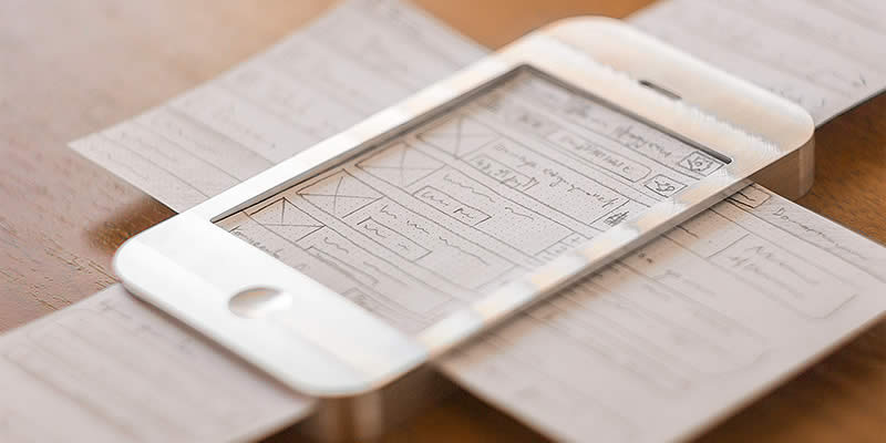
Paper
This is the most basic and accessible approach. It consists simply of taking out a piece of paper and sketching out screens and interaction components. Generally, all wireframes begin on paper and then develop through other tools prior to software design.
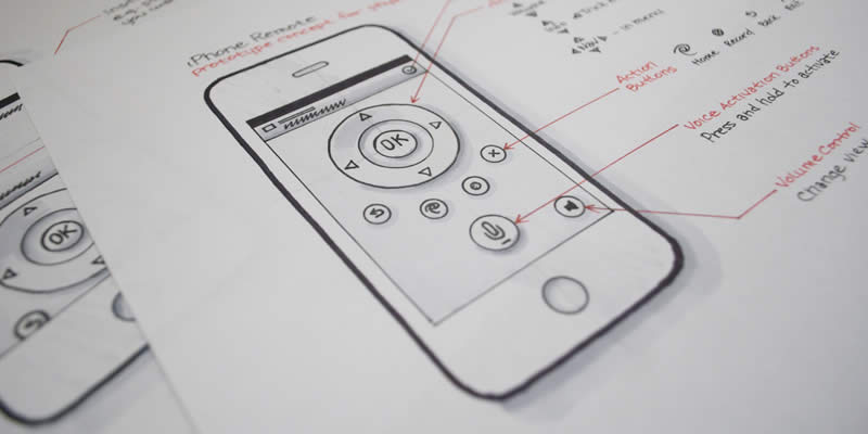
Stencils
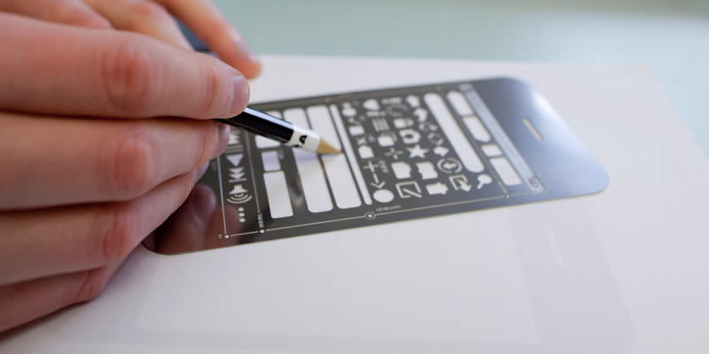
at the same time achieving more precise results than with freehand drawing.
This would be a next step. A bit more professional than a free- hand wireframe, it still retains the essence of work on paper. With the help of stencils, generally made of metal, it is possible to draw interaction elements directly on paper, with a much more formal, clean and uniform structure.
Templates
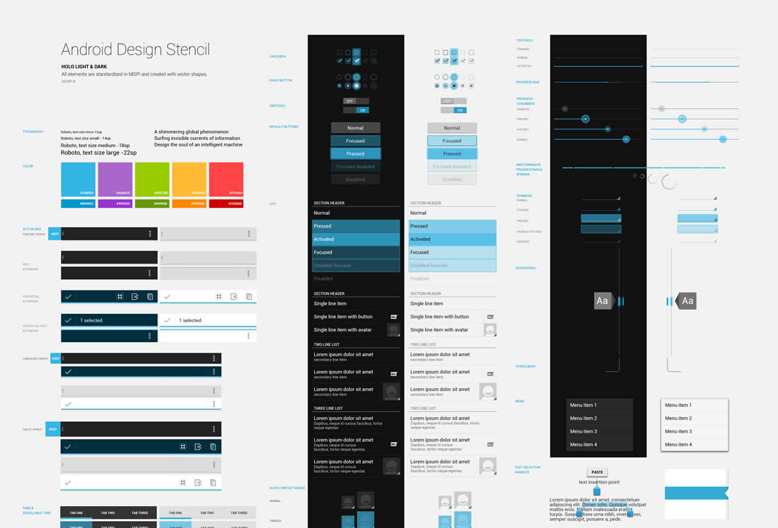
This way of creating a prototype consists of using digital files of templates that have basic interaction and interface elements (buttons, lists and headers) to build in a computer, using design programs, such as Photoshop, and basic screens based on those components. Depending on the operating system, different resources can be used; the ones that are more widespread are those from iOS, followed closely by Android. Currently, there are few templates available for Windows Phone.
Additionally, there is also desktop software on the market with template libraries for making wireframes. Some of the best known include Balsamiq, Omnigraffle and Axure, but there are many other options. If the intention is to design wireframes using a browser and saving proposals in the cloud, UXPin allows users to work collaboratively with other team members.
Choosing What’s Best
In reality, there is no better or worse way of creating wireframes. The alternatives we offer are the best known. Generally, the choice is made according to the complexity of the task at hand. It also depends on personal elements, such as comfort with the tool.
Certain designers can do a great job drawing on paper before working with a computer, and on the contrary, some people feel more at ease working directly with the computer, using templates and design programs.
It is advisable to try different options in order to find the one that offers comfort and agility and that adequately represents the ideas for the different screens of the app.
Prototypes
Prototypes are representations for internal testing or for user testing. They help detect usability errors in the early stages of design. Generally, they are models with enough interaction to navigate different screens.
Prototypes can be based on wireframes or visual designs. Their levels of fidelity vary according to how similar they are to the expected final version of the app in terms of appearance and behavior.
Which Screens Should Be Prototyped?
There is no need to make a prototype with all possible screens of an app. Prototypes are destined to be trials; therefore, they should be created only for the screens required for completing the task being tested. For example, to test a user login, the prototype should include all screens needed, from data input to the last message of success.
Prototype Formats
There are different ways of creating an app prototype, from drawing on paper to using traditional design software and even programs created exclusively to develop prototypes. The choice depends on immediacy and the resemblance to the expected final result.
According to the output format that can be obtained from a prototype (to then share with other team members, clients and stockholders), the ways of making prototypes can be classified as:
Interactive Documents
Prototypes can be presented as the same documents that have always been used for commercial presentations and information distribution, adding the necessary interaction that allows browsing from one part of the document to another.
For example, a PDF based on design files or photographs of a sketch of the app can represent its basic functions. Balsamiq is a tool that does this well.
The same can happen with presentation files like those used in Microsoft PowerPoint, Apple Keynote or OpenOffice documents. Using templates, Keynotopia creates documents that are compatible with these software products, and an interaction layer is added to simulate the behavior of the app.
In order to be opened, these kinds of documents have to be downloaded first. Transitions and animations that link pages can be somewhat basic.
Web Versions
Most prototype software, for both desktop and the cloud, creates representations of an app as websites based in HTML5 and CSS3 to show interactions and animations. Some of these programs even create a launch icon in the phone’s home screen in order to develop a simulation experience that is as similar to reality as possible.
Some of the tools used to create prototypes in this way are Codiqa, FluidUI, Framer and Flinto.
Other Formats
Alternatively, there is specific software available for developing prototypes. Briefs, for example, is a piece of software that can achieve results very similar to those of a native app. Using a desktop program, Briefs creates a simulation of the app that needs a special viewer (a free app) in the target phone in order to be opened.
If a very fast prototype is needed, built with the phone itself, a good tool is link: https://marvelapp.com/pop/ text: POP), an app that uses a mobile phone’s camera to photograph wireframes on paper and provide interaction to navigate different screens. This is an option that can bail you out of a tough situation and help to perform quick checks.